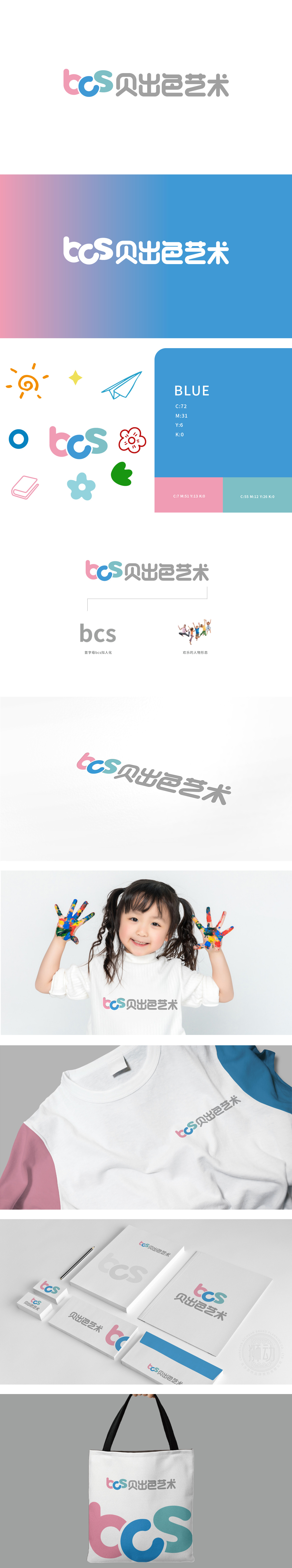
狮动设计通过“简化形态+卡通化细节”将字母转化为“有生命的儿童形象”:“b”:顶部的圆弧线条,增加了“俏皮感”,符合儿童对“可爱事物”的视觉认知;“c”:采用圆滚滚的闭合曲线,圆型在儿童心理学中代表“安全、亲切”,“s”:简化为“摆动的小尾巴”,曲线的流动感让整个字母组合更具“动态性”, 三者组合成一个“拟人化的字母生命体”,让儿童看到的瞬间产生“这是我的朋友”的情感连接。整体「用线条传递情绪,用色彩讲述故事,打造了一个「孩子能读懂的艺术符号」。
Lion design transforms letters into "living children's images" through "simplified form+cartoon details": "B": the arc line at the top adds a sense of playfulness, which accords with children's visual cognition of "cute things"; "C" is a round closed curve, which stands for "safety and kindness" in children's psychology, and "S" is simplified as "swinging little tail", and the fluidity of the curve makes the whole letter combination more dynamic, and the three are combined into an "anthropomorphic letter life", so that children can have an emotional connection of "this is my friend" at the moment of seeing it. "Using lines to convey emotions and telling stories with colors has created an" artistic symbol that children can read ".


扫码或拨打添加客服微信


