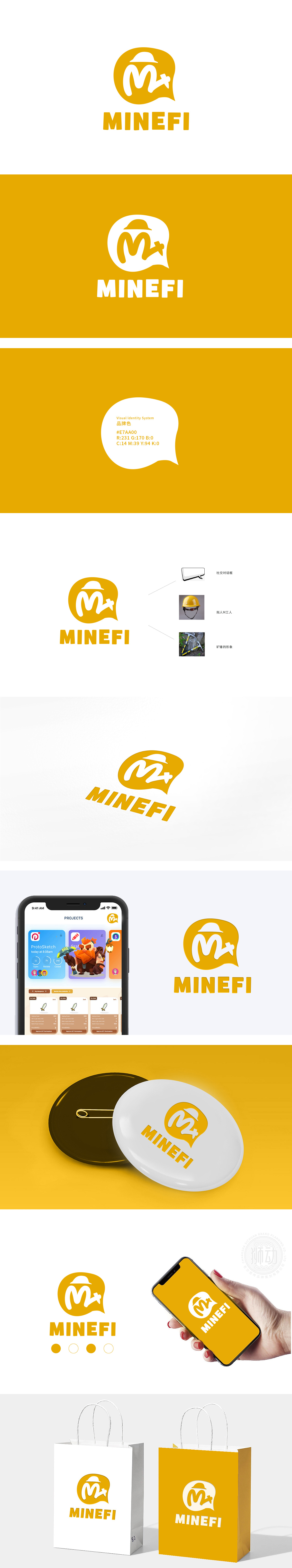
狮动设计以“社交+轻量级挖矿”的游戏核心体验为底层逻辑,将“社交场景”“角色身份”“核心玩法”三大关键信息,通过具象化、符号化的图形语言拆解重组,形成“一眼即懂”的视觉传达链路。暖黄色对话气泡+拟人M工人,暖黄色形态,直接关联“社交”属性,符合游戏“强社交”的核心卖点;暖黄色调传递活力、亲近感,整体设计将M字母变形为“拟人化工人”,实现了“视觉认知→情感认同→行动转化”的闭环,成为品牌从“0到1”引流的关键武器。
Lion Design takes the game core experience of "socializing+lightweight mining" as the underlying logic, and dissembles and reorganizes the three key information of "social scene", "role identity" and "core gameplay" through the graphic language of visualization and symbolization, thus forming a visual communication link that can be understood at a glance. Warm yellow dialogue bubble+anthropomorphic M worker, warm yellow form, directly related to the "social" attribute, in line with the core selling point of the game "strong social".


扫码或拨打添加客服微信


