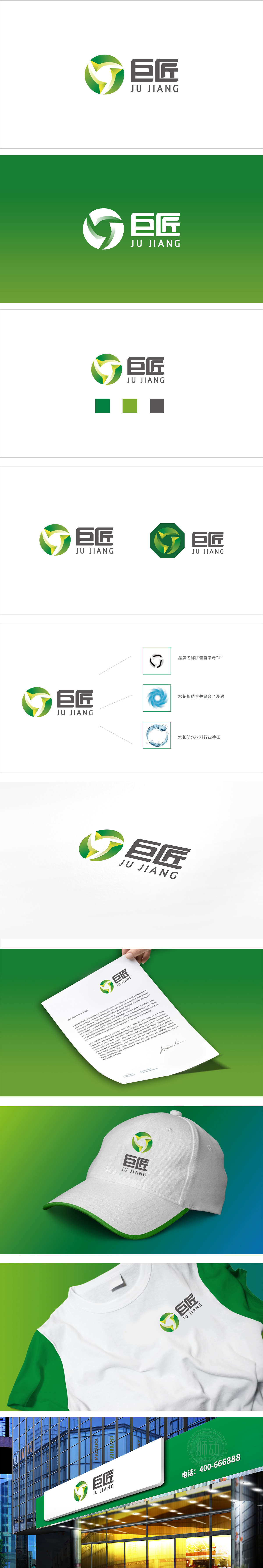
狮动设计以圆形代表“循环、完整”,暗合建材行业“资源回收再利用”的环保趋势,同时圆形的包容感也强化了品牌的“亲和力”;抽象叶片/箭头:圆形内部的黄色元素,既像叶片,又像箭头(象征前进、创新,符合现代建材“节能、智能”的发展方向)。用“巨匠”的汉字变形(框架+工具),将“工匠精神”转化为具体的视觉符号,既符合建材行业“重工艺”的特点,也传递了“环保不是牺牲品质,而是用匠心打造更耐用的材料”这一核心逻辑;通过简洁、有记忆点的视觉语言完美融合行业,这种“懂行业、懂用户、懂设计”的能力,确实让人佩服。
Lion design represents "circulation and integrity" with a circle, which coincides with the environmental protection trend of "resource recycling and reuse" in building materials industry, and at the same time, the circular tolerance also strengthens the brand's "affinity"; Abstract blade/arrow: the yellow element inside the circle is like both a blade and an arrow (symbolizing progress and innovation, in line with the development direction of "energy saving and intelligence" of modern building materials). The transformation of "craftsman spirit" into concrete visual symbols by using the Chinese character deformation (frame+tool) of "master" not only conforms.


扫码或拨打添加客服微信


