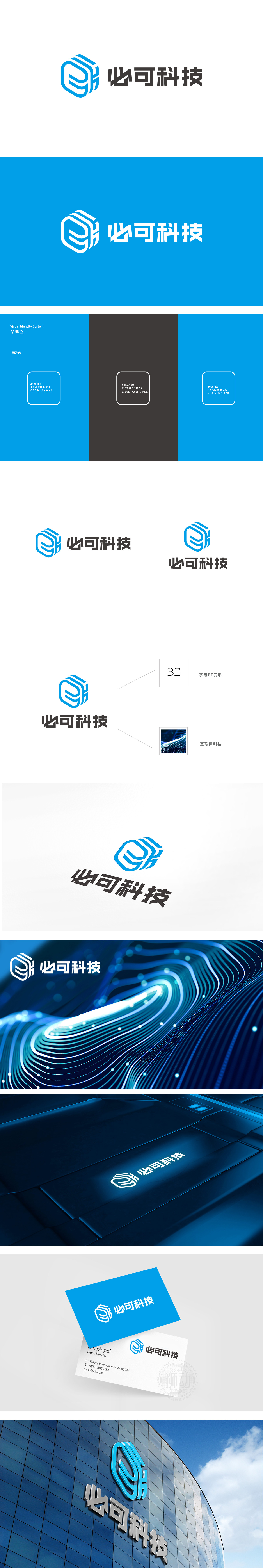
狮动设计用“E”讲透互联网本质,三个叠加的“E”形线条,组合成一个立体的立方体结构——最直接的联想是“互联网”(Internet)的标志性符号“E”,瞬间锚定行业属性;叠加的“E”像层层嵌套的网络节点,又像数据的流动与叠加,暗示互联网“连接、多元、立体”的特征;立体立方体的质感则传递科技的严谨性与逻辑性,符合互联网科技“用代码构建世界”的理性特质。蓝色代表专业、信任与未来感,像互联网的“冷静大脑”,让人联想到数据、算法与无限可能;所有元素共同指向“用科技连接一切的互联网公司”这一核心定位。
Lion design uses "E" to explain the essence of the Internet, and three superimposed "E"-shaped lines are combined into a three-dimensional cube structure-the most direct association is the iconic symbol "E" of the Internet, which instantly anchors the industry attributes; The superimposed "e" is like the nested network nodes layer by layer, and also like the flow and superposition of data, suggesting the characteristics of "connection, pluralism and three-dimensional" of the Internet;The texture of the three-dimensional cube conveys the rigor and logic of science and technology, which conforms to the rational characteristics of Internet technology "building the world with code". Blue represents professionalism.


扫码或拨打添加客服微信


