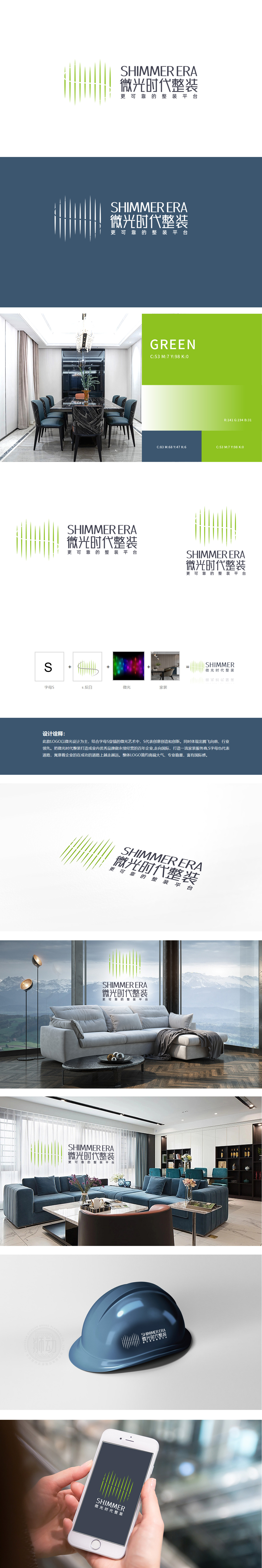
狮动设计通过字母S:作为最核心的抽象符号,既承担了“创意”“创新”的品牌精神传递,又通过“道路”的隐喻,寓意企业在成功的道路上越走越远”,为品牌注入了“持续成长”的时间维度。将S简化为“曲线+绿条纹”的组合,曲线模拟“腾飞”的动态,绿条纹则强化了“专业”与“生机”的行业联想,整体来看,设计既实现了“国际感”(简约风格、无衬线字体),又保留了“行业属性”(家装场景、绿色调),同时通过“S”的多重寓意,为品牌注入了“持续成长”的精神内涵,是一款“视觉有记忆点、寓意有深度、行业有锚点”的优质LOGO设计。
Lion design, with the letter S: as the core abstract symbol, not only undertakes the brand spirit transmission of "creativity" and "innovation", but also uses the metaphor of "road" to mention "meaning that enterprises are going further and further on the road to success" in the design interpretation, which injects the time dimension of "sustainable growth" into the brand. Simplifying S as a combination of "curve+green stripe", the curve simulates the dynamic of "soaring", while the green stripe strengthens the association between "professionalism" and "vitality".On the whole, the design not only realizes the "international sense.


扫码或拨打添加客服微信


