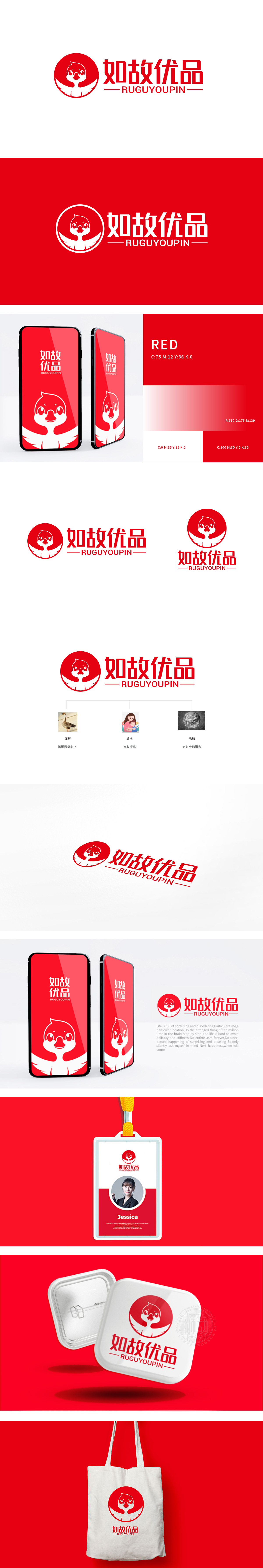
狮动设计用红色圆形+鸿雁变形,红色代表“热情、可靠”,鸿雁的“翅膀”与“向上姿态”传递“积极、成长”(暗示选品要“有生命力、能带来价值”),“如故”=“像老朋友一样熟悉、可信”,“优品”=“品质底线”,“地球”符号传递“我们的产品走向世界”,“用国际标准证明品质”,整体用视觉符号把品牌的“隐形价值观”变成了“用户的显性认知。
Lion design uses red circle+Hongyan deformation, red stands for "enthusiasm and reliability", and Hongyan's "wings" and "upward posture" convey "positivity and growth" (implying that the selection of products should be "vital and bring value"), "as old as ever" = "familiar and credible as old friends" and "excellent products" = "quality bottom line".


扫码或拨打添加客服微信


