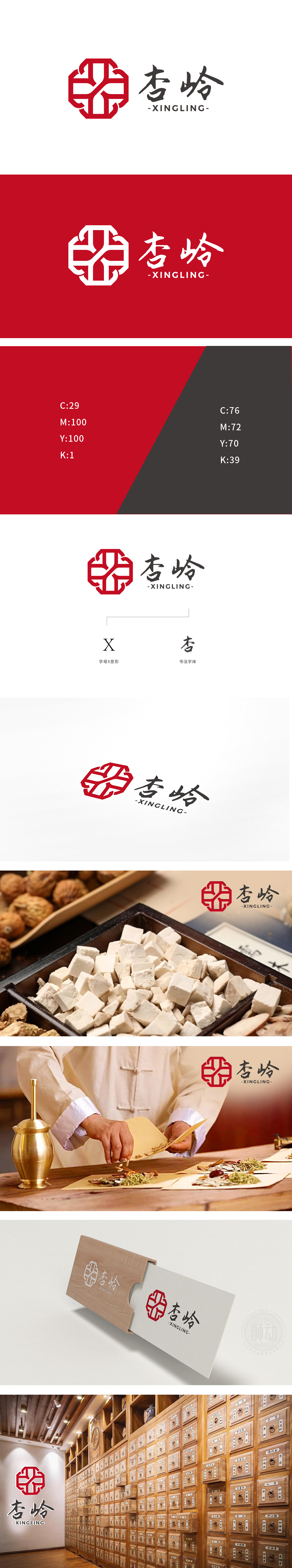
狮动设计采用传统元素的「现代转译」,红色八角形+交叉线条的组合,是整个LOGO的「视觉记忆点」,八角形:像传统窗格、八卦图,对应中医「五行八卦」的理论,也有「八方通达」的意思,暗合中医「经络贯通全身」的核心逻辑。交叉线条:看似抽象的「X/Y」结构,其实像中医里的「经络交汇」,也像「中药配伍」的象征就像线条一样相互交织、协同作用。红色:传统里代表「吉祥、温暖、气血」,正好符合中医「治未病」「温养身体」的理念,给人「治愈感」。整体设计既有「老中医」的靠谱感,又有「新品牌」的活力~
Lion design adopts the "modern translation" of traditional elements, and the combination of red octagon and cross lines is the "visual memory point" of the whole LOGO. Octagonal: like traditional panes and eight diagrams, it corresponds to the theory of five lines of gossip in traditional Chinese medicine and also means "reaching all directions", which coincides with the core logic of "meridians running through the whole body" in traditional Chinese medicine. Cross lines: the seemingly abstract "X/Y" structure is actually like the "intersection of meridians" in traditional Chinese medicine, and it is also like the symbol of "compatibility of traditional Chinese medicine", which is intertwined and synergistic like lines. Red: traditionally, it stands for "auspiciousness, warmth and qi and blood".


扫码或拨打添加客服微信


