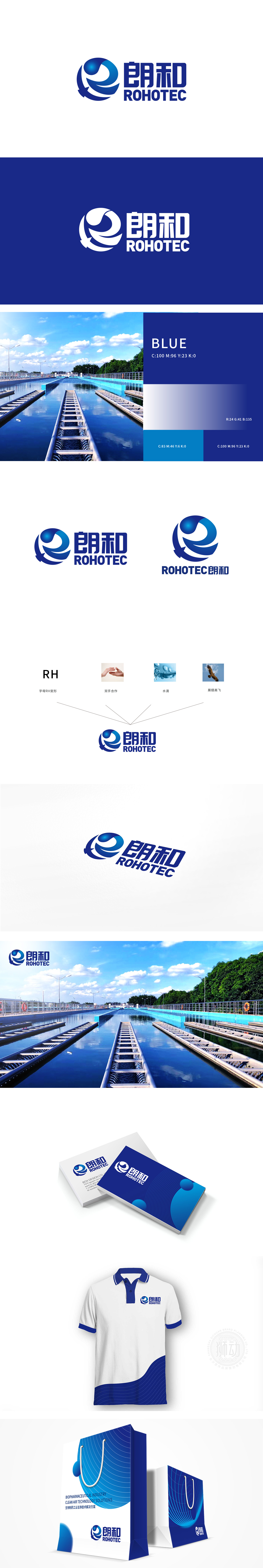
狮动设计以首字母简化(R+H的组合),是品牌的“基因符号”,将抽象的字母转化为可视觉化的记忆点;双手合作:象征“协同”——可能暗指企业与客户、行业伙伴甚至社会大众共同参与水环保事业,传递“环保不是独角戏”的理念;水滴:水环保的“核心符号”,直接关联品牌的业务领域,是视觉传达的“锚点”;展翅高飞:用飞鸟的动态象征“突破”与“希望”,暗示水环保事业的发展前景,通过“符号的逻辑关联”与“理念的视觉转化”,让品牌形象既专业又有温度。
Lion design is simplified by the first letter (combination of R+H), which is the "gene symbol" of the brand, transforming abstract letters into visual memory points; Hand-to-hand cooperation: a symbol of "cooperation"-it may imply that enterprises and customers, industry partners and even the public participate in the cause of water environmental protection together, and convey the idea that "environmental protection is not a one-man show"; Water drop: the "core symbol" of water environmental protection, directly related to the brand's business field, is the "anchor point" of visual communication.


扫码或拨打添加客服微信


