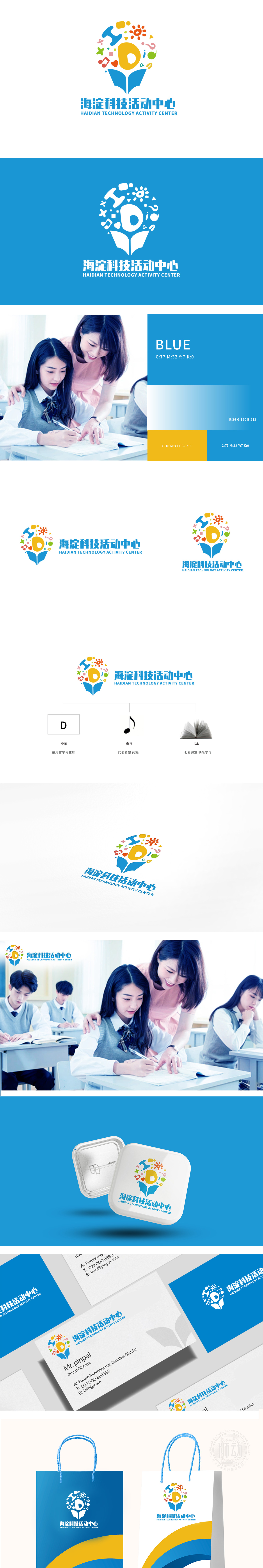
狮动设计采用灯泡+书本”的组合:灯泡象征“创意与灵感”(科技活动的核心是激发思维),书本则直接指向“学习”。两者叠加的设计特别妙——像“翻开的书里长出了创意的灯泡”,瞬间把“在学习中点燃创意”的活动理念可视化了。用首字母D做创意变形,既保留了品牌的识别性,又像一把“钥匙”——暗示“这里是开启知识大门的地方”;音符像“跳动的希望”,对应青少年的活力;内部的小元素(太阳、爱心、星星):这些符号都带着“温暖”和“希望”的情绪,像青少年的笑脸,让整个LOGO有了“生命力”,用图形做“教育理念的翻译官。
Lion design adopts the combination of light bulb and book: light bulb symbolizes "creativity and inspiration" (the core of scientific and technological activities is to stimulate thinking), while books directly point to "learning". The design of the superposition of the two is particularly wonderful-like "a creative light bulb grows in an open book", which instantly visualizes the activity concept of "igniting creativity in learning". Creative deformation with the initial d not only retains the brand recognition, but also acts as a "key"-implying that "this is the place to open the door to knowledge";The notes are like "beating hope", corresponding to the vitality of teenagers.


扫码或拨打添加客服微信


