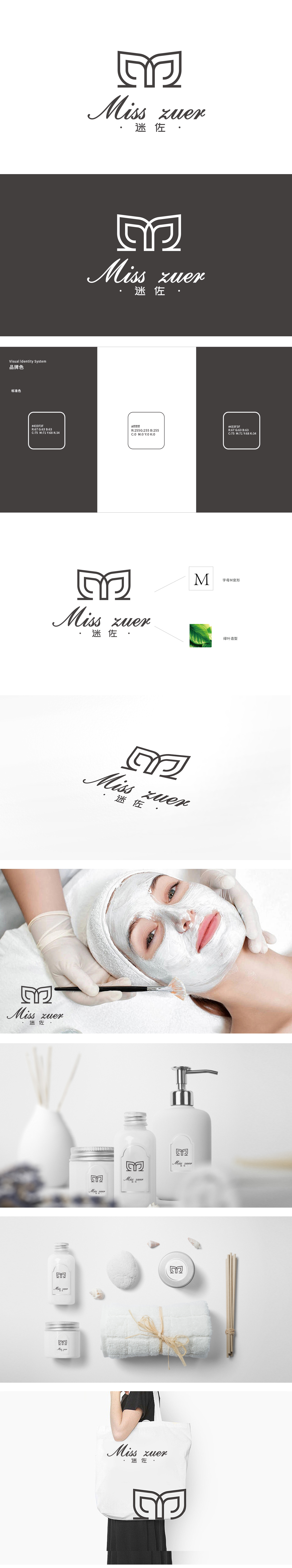
狮动设计以品牌名称首字母“M”为原型,通过对称、流畅的线条切割与重构,形成了类似“羽翼”或“花瓣”的造型。羽翼象征轻盈、呵护,花瓣则直接关联美容护肤的“自然、绽放”意象,贴合日化产品给人带来的精致感与美好联想。结合绿叶意象,暗示产品可能主打“天然成分辅佐肌肤健康”的定位,中间的连接部分形成向上的“汇聚”趋势,暗喻品牌对“美”的专注与凝聚,整体造型简约而不简单,记忆点极强,精准定位了“年轻、自然、精致”的品牌形象。
Liondesign is based on the initial letter "M" of the brand name, and forms a shape similar to "wings" or "petals" through symmetrical and smooth line cutting and reconstruction. Wings symbolize lightness and care, while petals are directly related to the "natural and blooming" image of beauty and skin care, which fits the exquisite feeling and beautiful association brought by daily chemical products. Combined with the image of green leaves, it is suggested that the product may focus on the positioning of "natural ingredients assisting skin health", and the connecting part in the middle forms an upward trend of "convergence", which implies the brand's focus and cohesion on "beauty".


扫码或拨打添加客服微信


