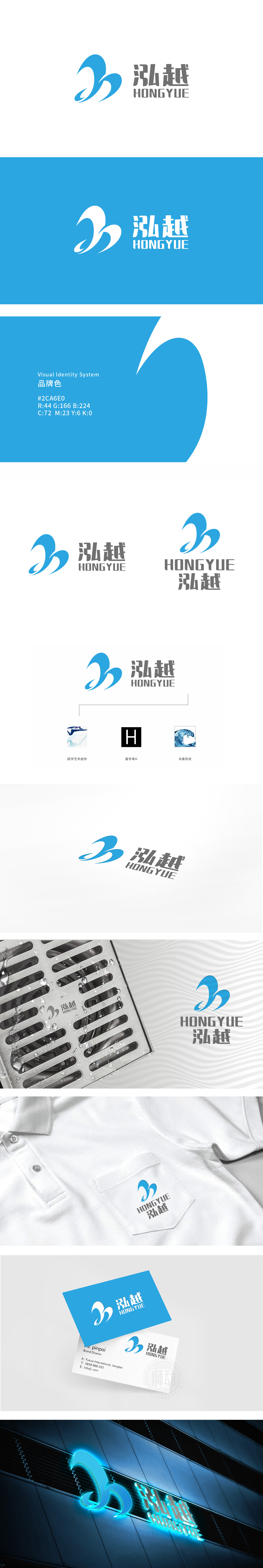
狮动设计采用首字母“H”的隐形植入,跃”字的动态延伸,以倾斜笔触增强动感,与水流图形的流动感形成呼应,既传递品牌“超越”的理念,蓝白渐变曲线构成核心图形,形似两股交汇的水流,则强化了产品的使用场景-水滴形式,都以极简图形完成行业属性的视觉锚定。通过水流的动态形态、品牌字符的意象化处理,构建了一套“可感知、可记忆、可延伸”的视觉系统。
Lion Design adopts the invisible implantation of the initial letter "H" and the dynamic extension of the word "Yue", and the inclined strokes enhance the sense of movement, which echoes the flow sense of the water flow graph, not only conveying the concept of brand "transcendence", but also strengthening the use scene of the product-whether it is tap water, shower water or basin water accumulation, the visual anchoring of industry attributes is completed with minimalist graphics.


扫码或拨打添加客服微信


