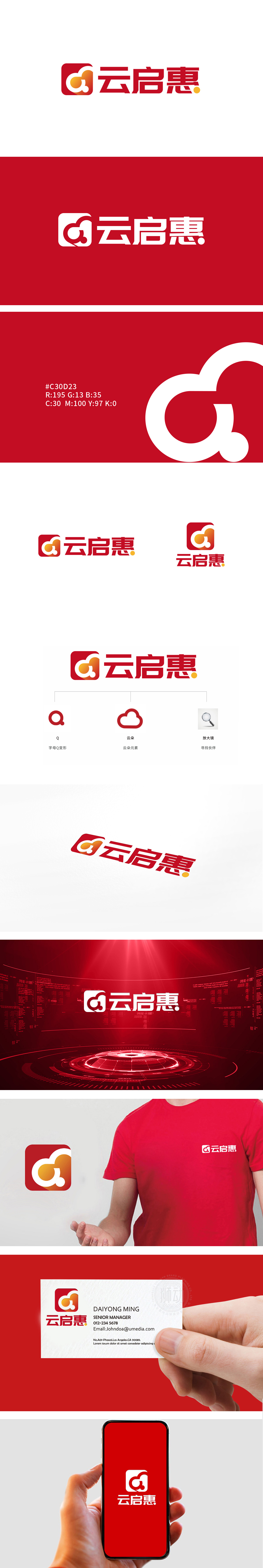
狮动团队将字母Q与云朵的融合,字母Q变形,Q的尾部微微上扬,增添动感,象征“启”(开启、启发)的积极意象。白色云朵轮廓,暗示科技属性(如云服务、数字化)或轻盈、便捷的品牌体验。标志以“Q型引擎+云端网络”的超现实组合,将“科技赋能连接,数据驱动普惠”的品牌内核炸裂开屏,让新客户惊叹的不仅是设计美学,更是其背后精准到像素级的商业逻辑编码。
Lion design the fusion of the letter Q and the clouds, the letter Q is deformed, and the tail of the letter Q rises slightly, adding movement and symbolizing the positive image of "enlightenment". The outline of white clouds suggests technological attributes (such as cloud services and digitalization) or a light and convenient brand experience. With the surreal combination of "Q-engine+cloud network", the logo explodes the brand core of "technology enabling connection and data driving Pratt & Whitney", which makes new customers marvel not only at the design aesthetics, but also at the pixel-level business logic coding behind it.


扫码或拨打添加客服微信


