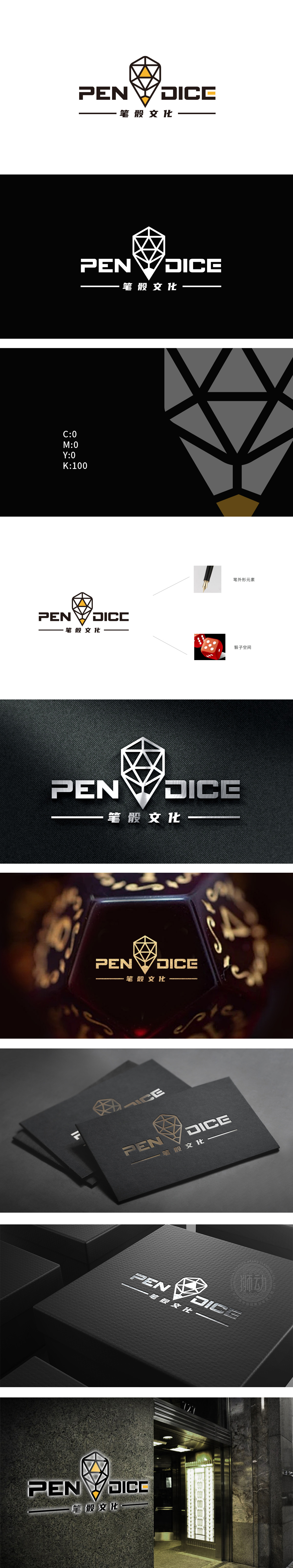
狮动设计以“笔”与“骰子”为核心创意点,用笔尖为原型,通过对称的三角形切割线条,勾勒出笔尖的锐利与向上延伸感,象征“书写”“创作”的核心功能。黄色填充的锐角三角形增强视觉焦点,传递活力与专业质感。骰子的空间解构:立方体的多面切割线条与内部三角结构,暗合骰子的“空间感”与“多面性”。线条的交错形成抽象的“骰面”,既保留了骰子的块状稳重感,又通过菱形切割弱化娱乐属性,赋予其文化品味。通过对“笔”与“骰子”的文化解码与视觉重构,成功为“笔骰文化”打造了兼具商业记忆点与文化深度的品牌符号。
Lion Design takes "pen" and "dice" as the core creative points, takes the pen tip as the prototype, and outlines the sharpness and upward extension of the pen tip through symmetrical triangle cutting lines, symbolizing the core functions of "writing" and "creation". The acute triangle filled with yellow enhances the visual focus and conveys vitality and professional texture. Spatial deconstruction of dice: the multi-faceted cutting lines and internal triangular structure of the cube coincide with the "sense of space" and "versatility" of dice. The crisscross of lines forms an abstract "dice surface".


扫码或拨打添加客服微信


