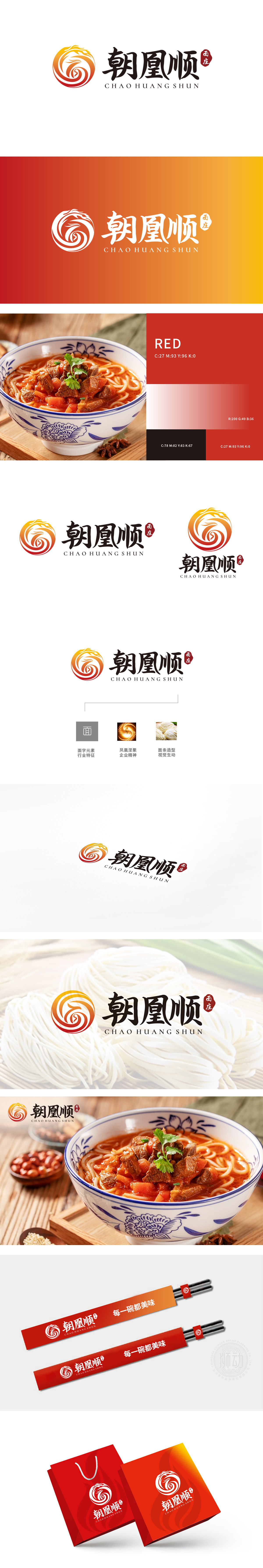
狮动设计以橙红渐变的凤凰盘旋造型为主,线条流畅如火焰升腾,既呼应“凰”字的吉祥寓意,又通过凤凰“涅槃重生”的文化内涵,暗喻品牌对食材新鲜度、工艺传承的追求。凤凰羽翼的卷曲弧度与拉面甩动时的动态感巧妙融合,远观似升腾的热气,近看又暗藏面条的柔韧质感,实现“抽象精神符号”与“具象产品形态”的双重解读。同时整体造型呈顺时针旋转,契合“顺”字的顺畅、顺心之意,既关联餐饮消费中“用餐体验顺畅”的需求,也暗示面条入口的顺滑口感。整个LOGO通过“凤凰(精神)+ 面条(产品)+ 文字(品类)”的黄金三角结构,用图形讲好“餐饮故事”。
Lion design is mainly based on the spiral shape of the orange-red gradient phoenix, with smooth lines rising like flames, which not only echoes the auspicious meaning of the word "phoenix", but also implies the brand's pursuit of fresh ingredients and technological inheritance through the cultural connotation of the phoenix's "nirvana rebirth". The curling radian of the Phoenix wings is ingeniously combined with the dynamic feeling of Lamian Noodles's flapping, which looks like rising hot air from a distance and hides the flexible texture of noodles from a close look, thus realizing the double interpretation of "abstract spiritual symbol" and "figurative product form".


扫码或拨打添加客服微信


