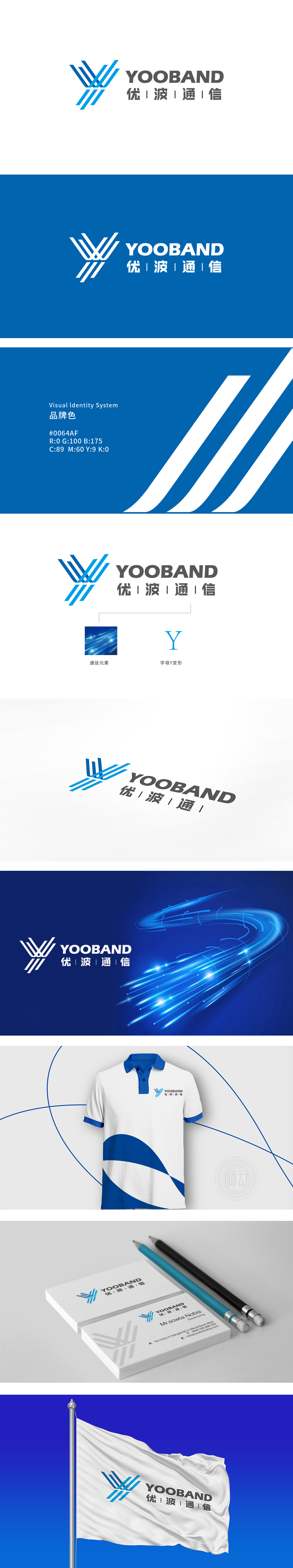
狮动设计以字母“Y” 为原型展开设计,通过多组蓝色渐变线条的交叉、延伸与动态排列,直观呼应通信行业“信号传输”“数据互联”的核心特性。 线条的交叉点形成视觉焦点,暗喻“信息节点”或“数据交互中心”,体现通信行业“连接人与信息、人与世界”的核心价值;传递“高效、稳定”的技术保障印象。蓝色在行业中常与“专业”“可靠”“创新”关联,契合通信技术企业的品牌气质;线条渐变增强层次感,隐喻信号的动态传播与技术的进阶性。
Lion Motion Design is based on the letter "Y". Through the intersection, extension and dynamic arrangement of several groups of blue gradient lines, it intuitively echoes the core characteristics of "signal transmission" and "data interconnection" in the communication industry. The intersection of lines forms a visual focus, which is a metaphor for "information node" or "data interaction center" and embodies the core value of "connecting people and information, people and the world" in the communication industry. Convey the impression of "efficient and stable" technical support. Blue is often associated with "professionalism", "reliability" and "innovation" in the industry.


扫码或拨打添加客服微信


