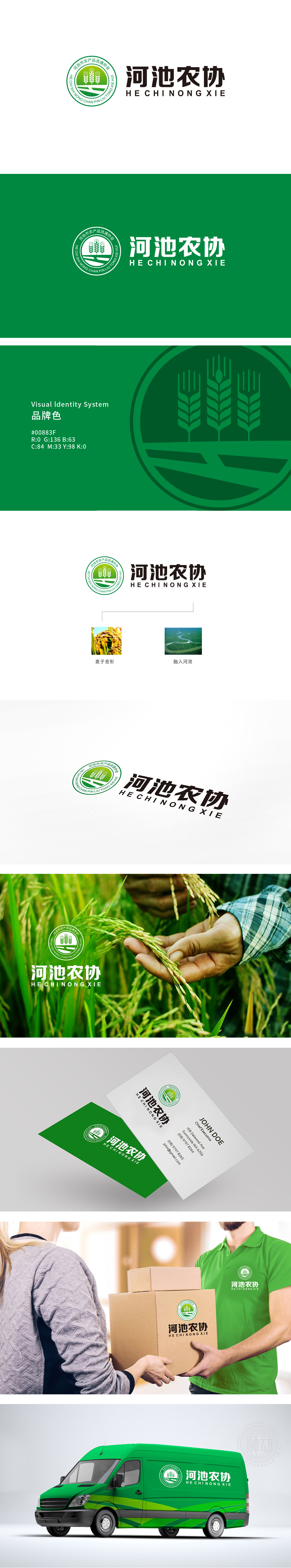
狮动设计以向上生长的麦穗为核心,直接点明“农产品流通协会”的行业属性;麦穗下方的波浪线条既象征农田的垄沟肌理,也暗喻河池地区的自然水系,整体传递出“立足土地、孕育丰收”的意象。绿色作为主色调,绿色既是农业的象征色(代表作物、生态、健康),也传递出“绿色农业”“可持续发展”的理念;环形构图象征协会对农产品流通的“纽带作用”,展现出对“农产品流通协会”这一特定角色的深刻理解——既是农业价值的“见证者”(丰收),也是价值传递的“推动者”(流通)。
Lion design takes the upward growing wheat ear as the core, and directly points out the industry attribute of "agricultural product circulation association"; The wavy lines below the ears of wheat not only symbolize the furrow texture of farmland, but also imply the natural water system in Hechi area, conveying the image of "basing on the land and gestating a bumper harvest" as a whole. As the main color, green is not only the symbolic color of agriculture (representing crops, ecology and health), but also conveys the concept of "green agriculture" and "sustainable development";


扫码或拨打添加客服微信


