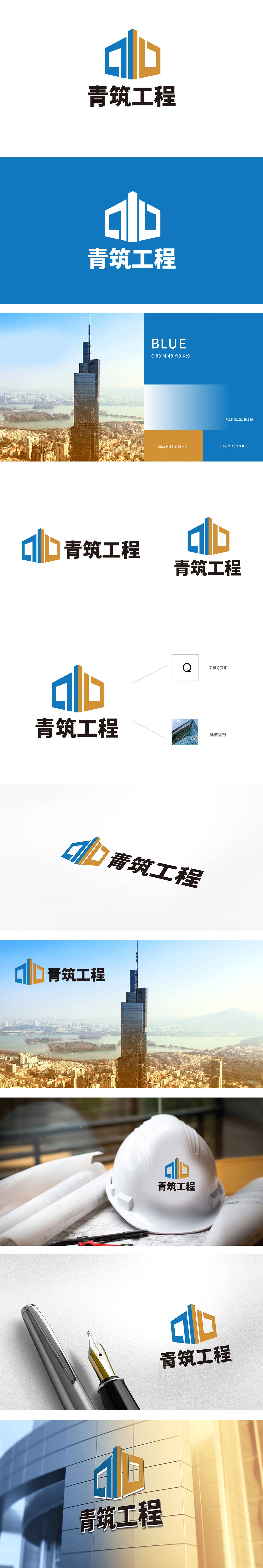
狮动设计以Logo中的图形部分源自字母“Q”的变形,体现了设计的创意性和独特性。图形同时模仿了现代建筑的外形,象征着公司的工程建筑属性,传达出专业和稳固的形象。蓝色和橙色的组合,蓝色代表信任和专业,橙色则增加活力和创新感,整体视觉,潮流配色、,不仅准确传达了主题,还具备高度的辨识度和艺术美感。
Lion design is based on the deformation of the letter "Q" in the graphic part of Logo, which embodies the creativity and uniqueness of the design. Graphics at the same time imitate the shape of modern architecture, symbolizing the company's engineering architectural attributes, and conveying a professional and stable image. The combination of blue and orange, blue represents trust and professionalism, and orange increases vitality and innovation.


扫码或拨打添加客服微信


