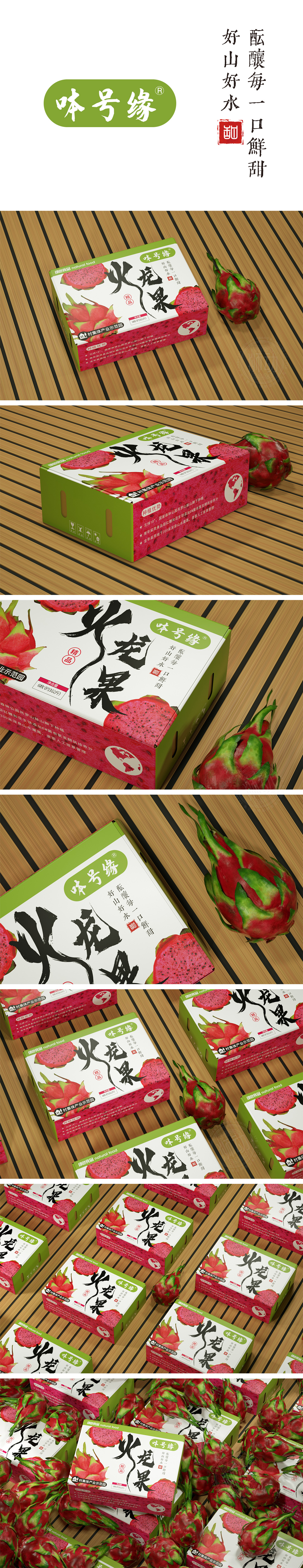
狮动设计以火龙果本身的红色、绿色、白色为核心色系:红色象征成熟与热情(果肉、底部纹理),绿色传递自然与健康,白色作为中性色平衡视觉冲击,整体色调高度贴合“生鲜水果”的清新属性,切开的火龙果果肉特写与完整果实插画形成组合,鲜红果肉与黑色籽的色彩对比极具冲击力,直观传递“红心火龙果”的核心品类特征,符合生鲜产品“所见即所得”的心理预期。整体设计从视觉符号(果肉特写)到信息传递(种植环境、认证背书),再到情感共鸣(自然、健康),每一处细节真正做到了“好看”与“好用”的平衡。
Lion design takes the red, green and white of pitaya as the core color system: red symbolizes maturity and enthusiasm (pulp and bottom texture), green conveys nature and health, and white as a neutral color balances visual impact. The overall color tone is highly suitable for the fresh attribute of "fresh fruit", and the close-up of the cut pitaya pulp is combined with the illustration of the whole fruit. The color contrast between bright red pulp and black seed is very impactful, which intuitively conveys the core category characteristics of "red pitaya". From visual symbols (close-up of pulp) to information transmission (planting environment, certification and endorsement), to emotional resonance (nature and health), every detail truly achieves a balance.


扫码或拨打添加客服微信


