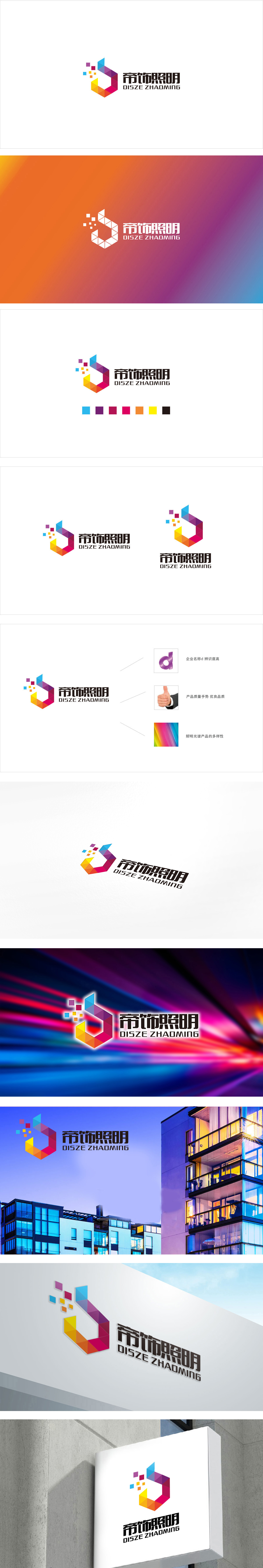
狮动设计采用照明行业的本质是“光与色的创造”,图形用“彩虹色拼接”+“光粒元素”直接呼应了这一点;“帝饰”的品牌名称需要“高端、华丽”,图形的“立体结构”+“高饱和颜色”完美传递了这一调性;现代品牌需要“科技感与亲和力”,图形的“几何拼接”+“小方块灵动性”实现了这一平衡。用“光”与“色”的本质,对话照明行业,“彩虹色”传递品牌调性,贴合“帝饰”的高端感。照明行业的核心竞争力之一是“光色的多样性”,而该LOGO的彩虹色拼接(或“全光谱色”)恰好击中了这一痛点,稳重与活力的互补,符合品牌长期发展需求。
Lion design using lighting industry is "the creation of light and color", and the graphics directly echo this point with "rainbow color splicing" and "light grain element"; The brand name of "Dishi" needs to be "high-end and gorgeous", and the "three-dimensional structure" and "high saturated color" of the graphics perfectly convey this tonality; Modern brands need "sense of science and technology and affinity", and the "geometric splicing" and "small square agility" of graphics have achieved this balance. With the essence of "light" and "color", we can talk about the lighting industry, and "rainbow color" conveys the tonality of the brand and fits the high-end feeling of "emperor decoration".


扫码或拨打添加客服微信


