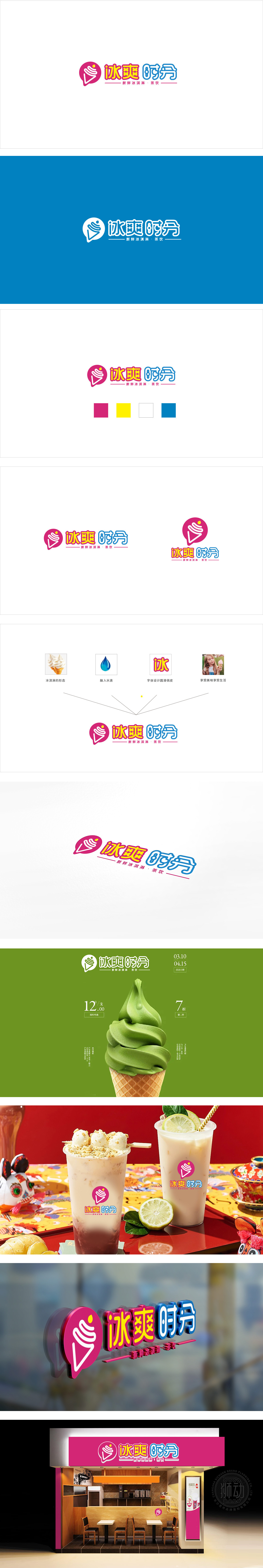
狮动设计将冰淇淋图标作为整个logo的“视觉锚点”,直接点出“冰淇淋”这个核心产品,而对话框的形状刚好模拟了“推荐”的动作(像店员在说“来试试我们的冰淇淋!”),完美贴合茶饮店“社交、分享”的属性;粉色的主背景+对话框形状,自带一种“可爱、亲切”的氛围,瞬间抓住年轻女生和小朋友的注意力;黄色的“冰爽”二字太妙了——明亮得像阳光下的冰淇淋,自带“清凉、甜蜜”的联想,从字体到细节,每一处都在说“我们是一家卖新鲜冰淇淋和茶饮的店,风格可爱、价格亲民,适合和朋友一起过来放松”。
Lion design takes the ice cream icon as the "visual anchor" of the whole logo, and directly points out the core product of "ice cream", while the shape of the dialog box just simulates the action of "recommendation" (like the clerk saying "Come and try our ice cream!" ), which perfectly fits the attributes of "social and sharing" of tea shops; Pink main background+dialog box shape, with a "cute and friendly" atmosphere, instantly catching the attention of young girls and children; The yellow word "Bingshuang" is wonderful-bright as ice cream in the sun, with its own association of "cool and sweet".


扫码或拨打添加客服微信


