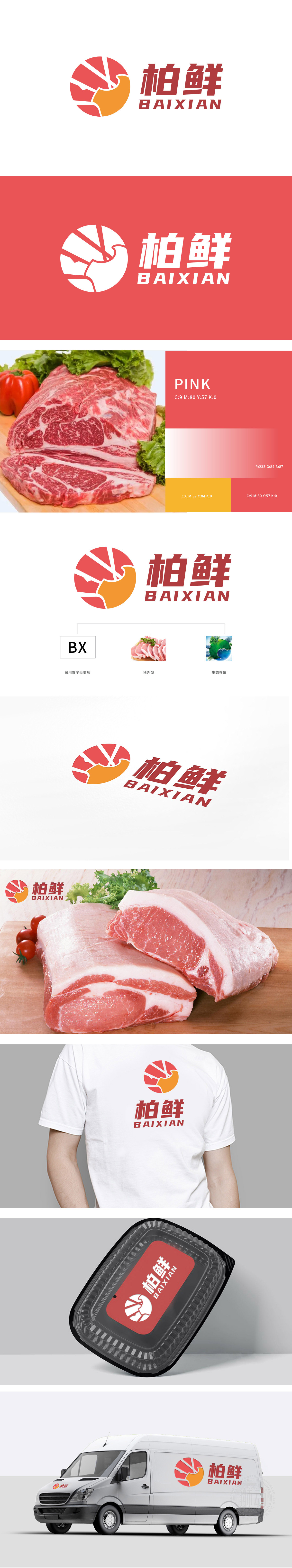
狮动设计以“柏鲜”首字母 “BX” 为基础进行变形,通过红色与橙色的几何切面组合,巧妙勾勒出 “猪”的头部轮廓,红色放射状背景既增强视觉张力,又暗合肉类的新鲜质感。整个设计体系从 品牌符号(BX变形)→ 品类符号→ 价值符号(生态养殖),层层递进,既用抽象图形提升了品牌调性,又夯实了“冷鲜肉+生态”的核心定位。
Lion design is based on the initial letter BX of Baixian, and the head outline of the pig is cleverly outlined through the combination of red and orange geometric sections. The red radial background not only enhances the visual tension, but also coincides with the fresh texture of the meat. The whole design system is progressive from brand symbol (BX deformation) → category symbol → value symbol (ecological farming), which not only improves the brand tonality with abstract graphics.


扫码或拨打添加客服微信


