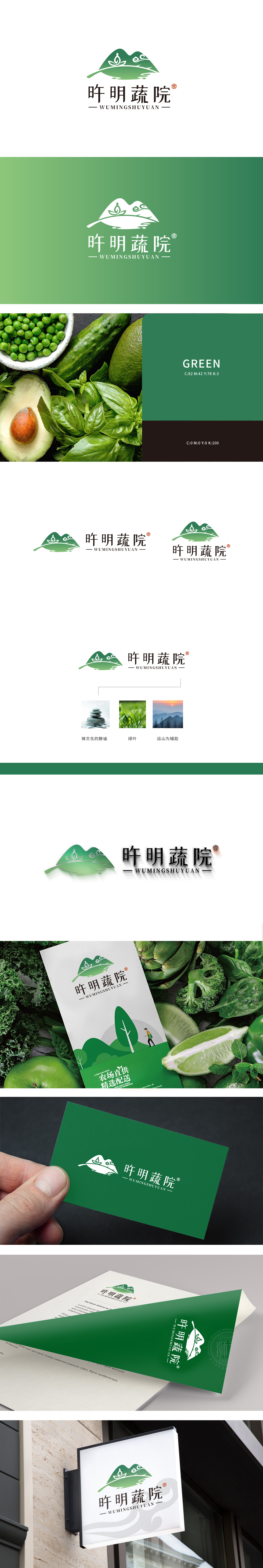
狮动设计以极简线条与渐变色彩构建出"从自然到生活"的视觉逻辑,每一层均对应品牌核心卖点:采用扁平化渐变绿(浅绿→深绿)勾勒出简化的远山轮廓,曲线柔和且有层次感,似连绵的深山黛影。象征意义:直接关联品牌"从深山到餐桌"的生鲜产地属性,用"远山"这一强地理符号,传递"食材来自生态纯净之地"的信任感。绿叶直接传递"食材鲜到能掐出水"的直观感受。莲花是禅文化的核心符号,代表"纯净、本真",此处与生鲜结合,传递"食材保留自然本味"的健康主张,整体通过自然元素的符号化处理与禅意情感的注入,成功将"生态有机生鲜"的品牌卖点,转化为"有温度、有仪式感的健康生活"的视觉表达。
Lion Design constructs the visual logic of "from nature to life" with minimalist lines and gradient colors, and each layer corresponds to the brand's core selling point: the flat gradient green (light green → dark green) is used to outline the simplified outline of the distant mountains, and the curve is soft and layered, like a continuous deep mountain shadow. Symbolic significance: directly related to the brand "from the deep mountain to the dining table" fresh origin attribute, with the strong geographical symbol of "distant mountain", convey the trust that "the ingredients come from the ecologically pure land".Green leaves directly convey the intuitive feeling that "the ingredients are fresh enough to pinch water". Lotus is the core symbol of Zen culture.


扫码或拨打添加客服微信


