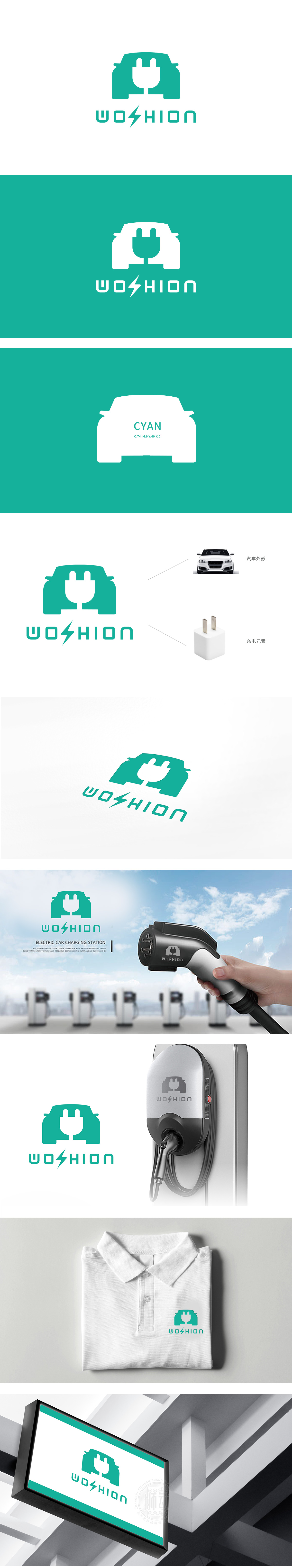
狮动设计采用汽车轮廓与充电插头的负空间设计——绿色车身轮廓简洁大气,既保留了汽车前脸的标志性线条,又通过中央白色区域自然勾勒出插头的双插脚形态,巧妙呼应了下方的充电插头元素图。这种“一形双意”的设计,直观传递出“新能源汽车充电”的核心业务场景,信息密度高且极具记忆点。主色调选用清新的蓝绿色,既象征新能源的环保属性,又传递出科技领域的冷静与专业;通过正负形穿插形成“功能(充电)赋能产品(汽车)”的视觉隐喻。
Lion design adopts the negative space design of the car outline and the charging plug-the green body outline is simple and atmospheric, which not only retains the iconic lines of the front face of the car, but also naturally outlines the double-pin shape of the plug through the central white area, cleverly echoing the element diagram of the charging plug below. This "one form and two meanings" design intuitively conveys the core business scene of "new energy vehicle charging", with high information density and great memory.


扫码或拨打添加客服微信


