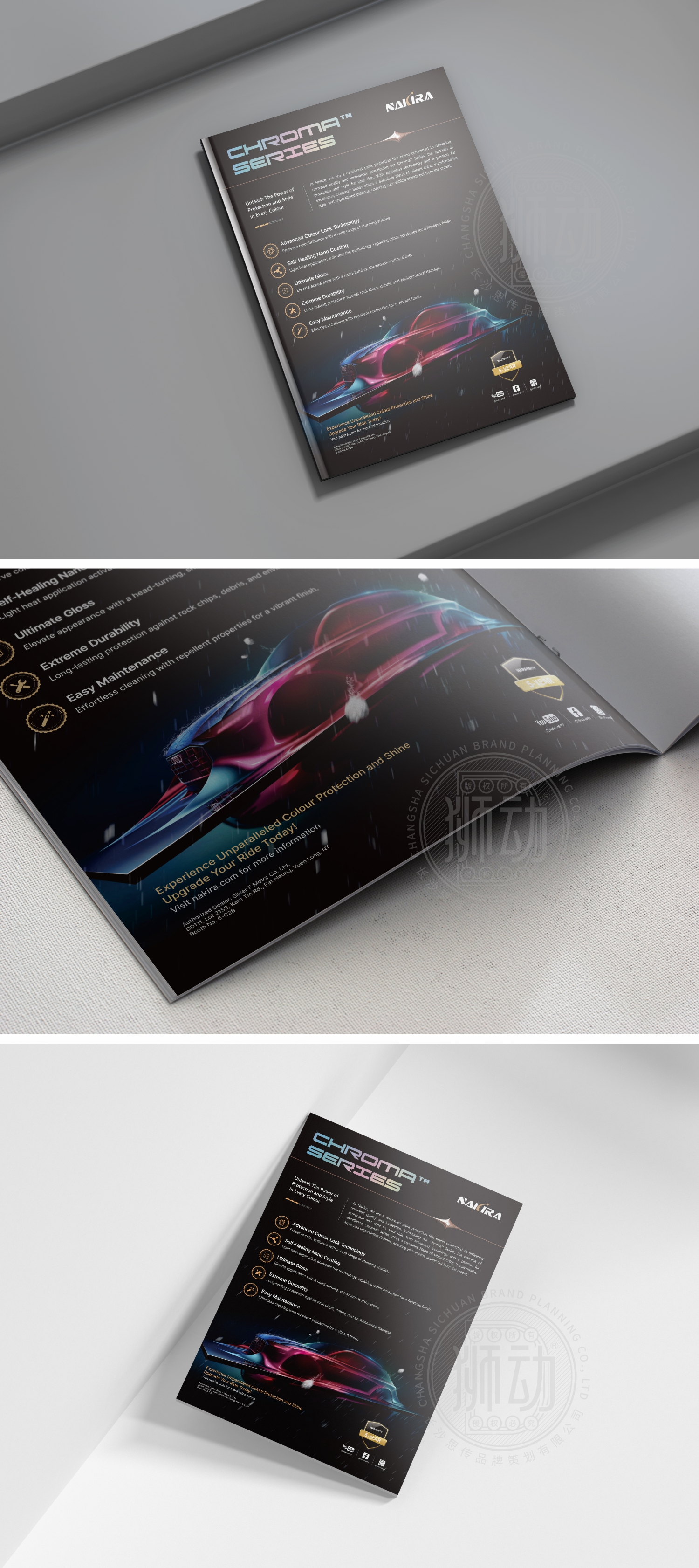
当Nakira以“重新定义汽车色彩表达”为目标开拓市场时,狮动设计团队精准捕捉品牌内核:从车膜“精准工艺+个性色彩”的核心优势切入,为CHROMA SERIES系列打造标识——渐变霓虹字体模拟车膜透光时的色彩流动感,金属质感的NAKIRA品牌名呼应高端工艺;版式以极简线条划分信息区,暗调底色凸显“精准贴合、风格定制”的产品特质。新客咨询时多次反馈“看logo就感受到专业与个性”。狮动用视觉语言,让品牌价值先于产品触达用户。
When Nokira opened up the market with the goal of "redefining the expression of automobile color", the Lion Design Team accurately captured the core of the brand: starting from the core advantages of "precise technology+individual color" of the automobile film, creating a logo for the CHROMA SERIES series-the gradient neon font simulates the color flow of the automobile film when it is transparent, and the brand name of Nokira with metallic texture echoes the high-end technology; The layout divides the information area with minimalist lines, and the dark background highlights the product characteristics of "precise fit and customized style".


扫码或拨打添加客服微信


