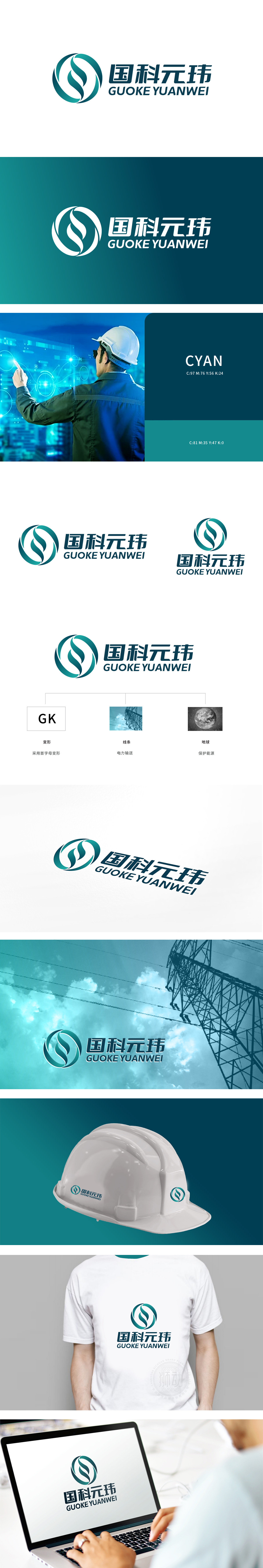
狮动设计以流畅的蓝绿色曲线构成环形与“S”形交织的图案,整体呈现旋转上升的视觉动势。环形结构与铁塔的“放射状电网”形成视觉呼应;蓝绿色调的选择既符合能源行业的“科技感”,也暗含“清洁能源”“环保”的行业趋势,整体通过几何化处理与主Logo的曲线形成刚柔对比,明确指向能源、电力等核心业务领域,实现了“品牌名称-视觉符号-行业场景”的逻辑闭环。
Lion design forms a circular and "S"-shaped interwoven pattern with a smooth blue-green curve, showing a rotating and rising visual motion as a whole. The ring structure forms a visual echo with the "radial power grid" of the tower; Thechoice of blue-green tone not only conforms to the "scientific sense" of the energy industry, but also implies the industry trend of "clean energy" and "environmental protection". As a whole, it forms a rigid-flexible contrast with the curve of themain Logo through geometric processing.


扫码或拨打添加客服微信


