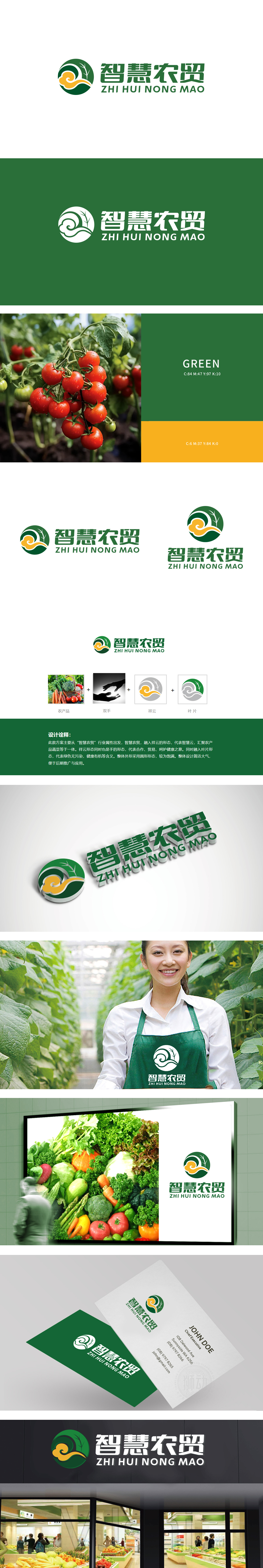
狮动团队以专业视角精准捕捉“自然、健康、可持续”的核心诉求,创新性地将圆形轮廓与枝叶纹理结合,象征生态循环与蓬勃生机;绿色基底传递有机本质,枝叶与云朵组合寓意生长活力,黄色渐变点缀如阳光浸润,黄色点缀传递丰收能量。字体设计兼顾稳重与现代感,中英文融合提升品牌兼容性。客户最终选择该方案,因其既直观呼应农产品属性,又以简洁而富有层次感的视觉语言,精准传递品牌差异化价值,获得市场与消费者共鸣。
The Lion Movement Team accurately captures the core appeal of "nature, health and sustainability" from a professional perspective, and innovatively combines the circular outline with the texture of branches and leaves, symbolizing the ecological cycle and vitality; The green base conveys the organic essence, the combination of branches and leaves and clouds symbolizes the growth vitality, the yellow gradient embellishment is like sunlight infiltration, and the yellow embellishment conveys the harvest energy. Font design gives consideration to stability and modernity, and the integration of Chinese and English enhances brand compatibility.


扫码或拨打添加客服微信


