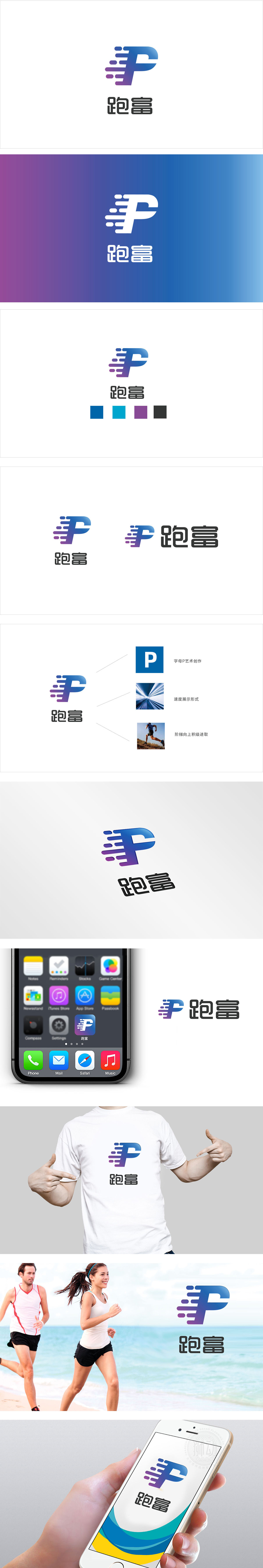
狮动设计采用字母“P”,字母右侧延伸出多组渐变的“速度线条”,模拟运动中的轨迹感,直接对应“跑”的核心动作,将“跑”的动态转化为可视化的图形符号;线条的“流动感”与“P”字母的“坚实感”结合,既传递了“前进、奔跑”的行动力,也隐含了“积累、沉淀”的财富属性,实现了“跑”与“富”的概念融合。 渐变过渡自然,保留了颜色的层次感,,符合大众对“财富”的直观联想(稳定且有增长潜力)。整体风格既现代(符合年轻用户的审美),又不失专业(适合面向有财富管理需求的群体),覆盖了广泛的目标受众。
Liondesign adopts the letter "P", and several groups of gradual "speed lines" extend from the right side of the letter to simulate the sense of track in motion, which directly corresponds to the core action of "running" and transforms the dynamics of "running" into visual graphic symbols. The combination of the "fluidity" of lines and the "solidity" of the letter "P" not only conveys the action force of "going forward and running", but also implies the wealth attribute of "accumulation and precipitation", thus realizing the integration of the concepts of "running" and "wealth".


扫码或拨打添加客服微信


