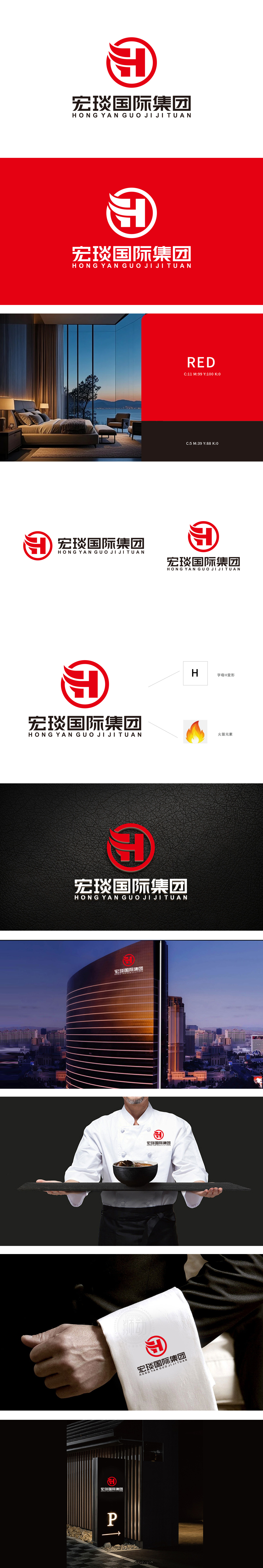
狮动设计以红色圆形为基底,内部的“H”既是企业名称首字母的抽象化呈现,顶部飘逸的曲线又与右侧标注的“火苗元素”形成呼应——火焰的灵动形态不仅暗合餐饮行业“烟火气”的核心属性,还通过流畅的笔触传递出品牌的活力与温度,让“综合型餐饮”的定位在图形中自然流露。整体设计将「国际视野的结构美学」与「餐饮行业的烟火灵魂」熔铸于一的创作,让宏琰国际的品牌形象从诞生即自带「现象级冲击力」——红与火的碰撞,是食欲的唤醒,更是野心的宣告。是用味觉连接世界的文化桥梁。
Lion design is based on a red circle, and the internal "H" is not only an abstract presentation of the initials of the enterprise name, but also the elegant curve at the top echoes the "flame element" marked on the right. The smart form of flame not only coincides with the core attribute of "fireworks" in the catering industry, but also conveys the vitality and temperature of the brand through smooth strokes, so that the positioning of "comprehensive catering" is naturally revealed in the graphics. The overall design combines the "structural aesthetics of international vision" with the "fireworks soul of catering industry", which makes the brand image of Acer International have a "phenomenal impact" from its birth-the collision between red and fire.


扫码或拨打添加客服微信


