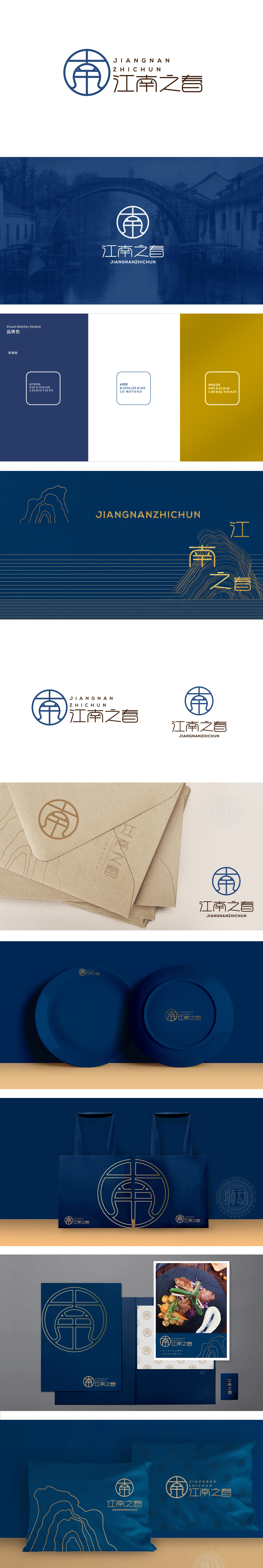
狮动设计以圆形轮廓为基底,既呼应中式美学中“圆满、和谐”的哲学观,又暗合传统园林“移步换景”的框景意境,仿佛通过一扇江南花窗窥见春色,画面感极强。“春”作为季节意象,代表生机、新鲜、希望,LOGO通过线条的轻盈感,传递“春日”的灵动,与餐饮行业“新鲜食材”“舒适体验”的属性形成隐性关联,实现“文化价值”与“消费场景”的双重锚定。整体以圆窗为框,冠帽为魂,蓝调为韵,短短几笔便让“文人雅韵”与“春日生机”破壁而来。这个名为“江南之春”的LOGO,没有一滴水墨,却让观者秒入“烟雨杏花江南”的意境;不见一片绿叶,却让“春味”在视觉里活了过来。
Lion design is based on the circular outline, which not only echoes the philosophical view of "perfection and harmony" in Chinese aesthetics, but also coincides with the artistic conception of the traditional garden "moving steps to change scenery", as if to see the spring scenery through a flower window in the south of the Yangtze River, with a strong sense of picture. As a seasonal image, "spring" represents vitality, freshness and hope. LOGO conveys the agility of "spring day" through the lightness of lines, and forms a hidden connection with the attributes of "fresh ingredients" and "comfortable experience" in the catering industry, thus realizing the double anchoring of "cultural value" and "consumption scene". As a whole, the round window is the frame.


扫码或拨打添加客服微信


