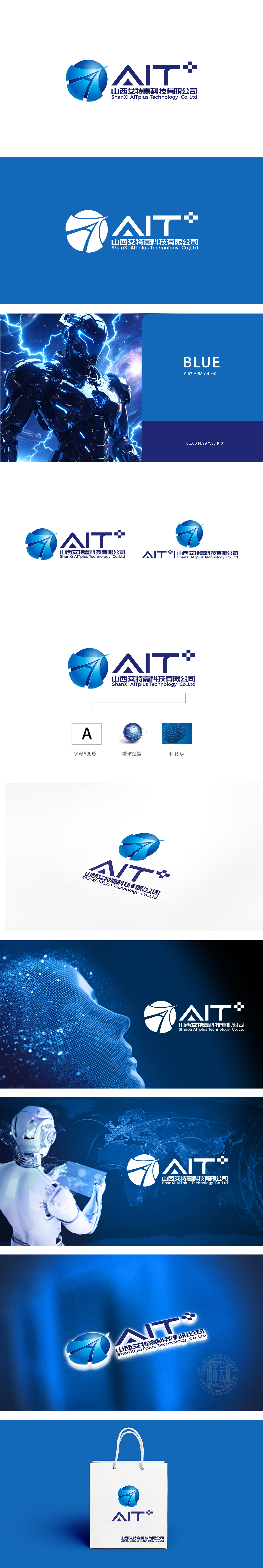
狮动设计通过“A”的顶部锐角与左侧图形的箭头形成视觉呼应,强化“向上、引领”的意象;“T”右侧的“+”符号不仅是数学意义上的“增量”,更暗示“技术赋能”“价值叠加”,与“AI智能”的“迭代升级”属性高度契合,简洁却富有深意。将蓝色球形图案以几何切割面构成,线条锐利且富有流动性,仿佛抽象化的“地球”或“科技核心”,内嵌的箭头元素既象征突破与前进,又暗合“AI智能”的精准与方向感。蓝色主调传递出科技行业的专业、可靠与冷静特质,渐变光影增强了立体层次,避免了扁平化设计的单调,整体造型现代且具有记忆点,符合科技企业“前沿、创新”的品牌定位。
Lion design forms a visual echo with the arrow of the left figure through the acute angle at the top of "A", which strengthens the image of "upward and leading"; The "+"symbol on the right side of "T" is not only an increment in the mathematical sense, but also implies "technical empowerment" and "value superposition", which is highly consistent with the "iterative upgrade" attribute of "AI intelligence", concise but meaningful. The blue spherical pattern is composed of geometric cutting surfaces, and the lines are sharp and fluid, like the abstract "earth" or "core of science and technology". The embedded arrow elements not only symbolize breakthrough and progress, but also coincide with the sense of precision and direction of "AI intelligence".


扫码或拨打添加客服微信


