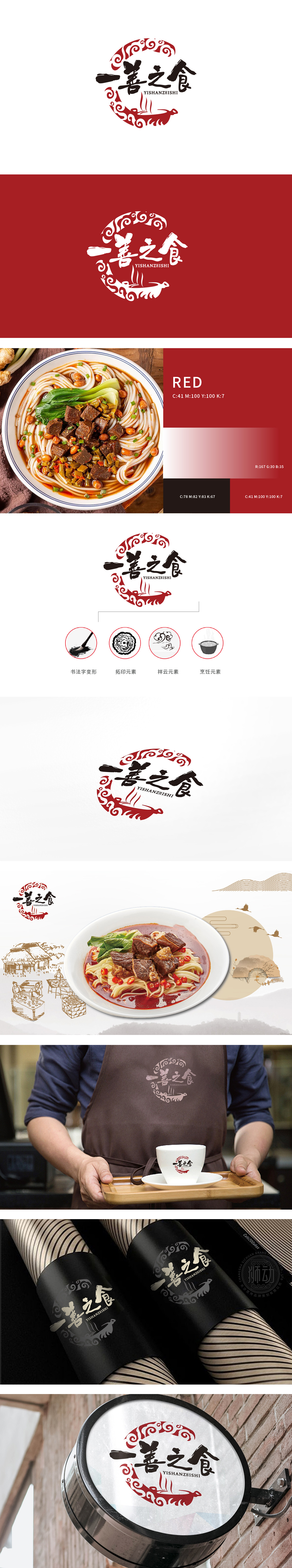
狮动设计以红墨撞色破局,一眼入魂的中式餐饮符号,品牌名“一善之食”自带“以善为食”“食养善念”的价值观,设计中通过传统元素的叠加,将抽象的“善”具象化为文化符号:书法与拓印:传递“传承之善”——对传统饮食文化的尊重与延续;祥云与狮纹:传递“吉祥之善”——赋予食物祝福、美好的情感价值;汤锅与蒸汽:传递“温度之善”——以食物为载体,连接人与人之间的温暖关系。整体将红与黑的撞色如泼墨入瓷,狮纹拓印的狞厉与祥云的飘逸刚柔相济,将"食"的烟火气与"善"的东方哲思,凝练成一枚自带声量的视觉图腾。
Lion Design is a Chinese restaurant symbol with red ink, which is fascinating at a glance. The brand name "A Good Food" has its own values of "feeding on goodness" and "feeding and nourishing good thoughts". In the design, the abstract "goodness" is visualized as a cultural symbol through the superposition of traditional elements: calligraphy and rubbing: conveying "inherited goodness"-respect and continuation of traditional food culture; Xiangyun and lion tattoo: convey "good luck"-give food blessings and beautiful emotional value; Soup pot and steam: transmitting "the goodness of temperature"-connecting the warm relationship between people with food as the carrier.


扫码或拨打添加客服微信


