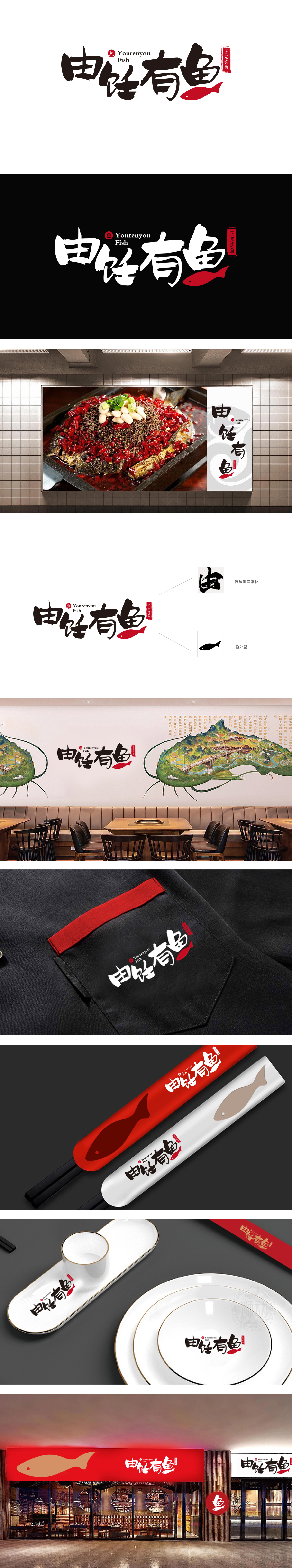
狮动设计采用传统手写毛笔字体企业名称,笔触浑厚有力,“由”“饪”“有”三字以浓黑墨色呈现,传递出中式烹饪的“匠心感”;融入抽象鱼形线条,使文字本身成为视觉符号,既保留书法的艺术美感,又隐晦呼应“鱼”的核心品类,传递出“鲜活”“灵动”的品牌联想(红色作为中国传统吉祥色,象征“红火”“喜庆”,又通过高饱和色彩形成视觉焦点,由饪有鱼”用一把毛笔、一尾红鳞,炸出了中式餐饮的“视觉新江湖”!没有堆砌符号,却让“鱼的鲜”“灶的火”“匠的魂”全藏在笔墨里——这才是让食客看到logo就想掀锅的中式餐饮设计。
Lion design adopts the traditional handwritten brush font enterprise name, with strong strokes, and the words "you", "cooking" and "you" are presented in thick black ink, conveying the "ingenuity" of Chinese cooking; Incorporating abstract fish-shaped lines, the characters themselves become visual symbols, which not only retains the artistic aesthetic feeling of calligraphy, but also implicitly echoes the core category of "fish", conveying the brand association of "liveliness" and "agility" (red, as a traditional auspicious color in China, symbolizes "prosperity" and "jubilation", and forms a visual focus through high saturated colors. From cooking with fish, a Chinese style is fried with a brush and a red scale..


扫码或拨打添加客服微信


