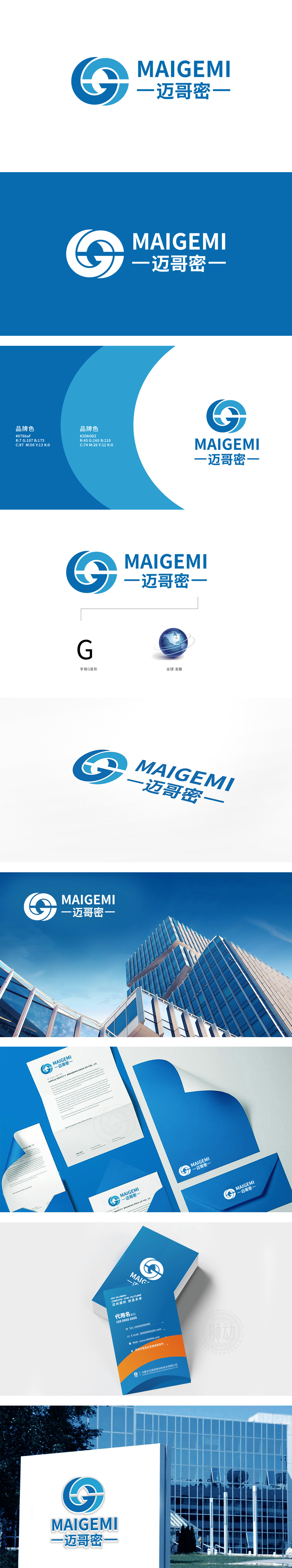
狮动设计以蓝色渐变的环形结构,构成字母“G”的意象,环形线条流畅且富有动感,这种设计既呼应了品牌名称中的“G”,又暗合建材行业的核心属性——构建、连接、稳固,传递出“通过精密工艺实现结构完整性”的联想。深蓝色作为主色调,常用于科技、工业、建筑领域,象征专业、可靠、高品质,符合建材产品对“安全”“耐用”的价值诉求;整体通过图形的“动态结构感”、色彩的“专业信任感”、字体的“现代工业风”,成功将建材行业的“连接”“精密”“可靠”等核心价值转化为可视化设计语言,让“建材”不再是冰冷的产品,而成为“精密工艺+现代美学”的载体。
Liondesign uses the ring structure with gradual blue change to form the image of the letter "G", and the ring lines are smooth and dynamic. This design not only echoes the "G" in the brand name, but also coincides with the core attributes of the building materials industry-construction, connection and stability, and conveys the association of "achieving structural integrity through precision technology". As the main color, dark blue is often used in the fields of science and technology, industry and architecture, which symbolizes professionalism, reliability and high quality, and conforms to the value demands of building materials products for "safety" and "durability".


扫码或拨打添加客服微信


