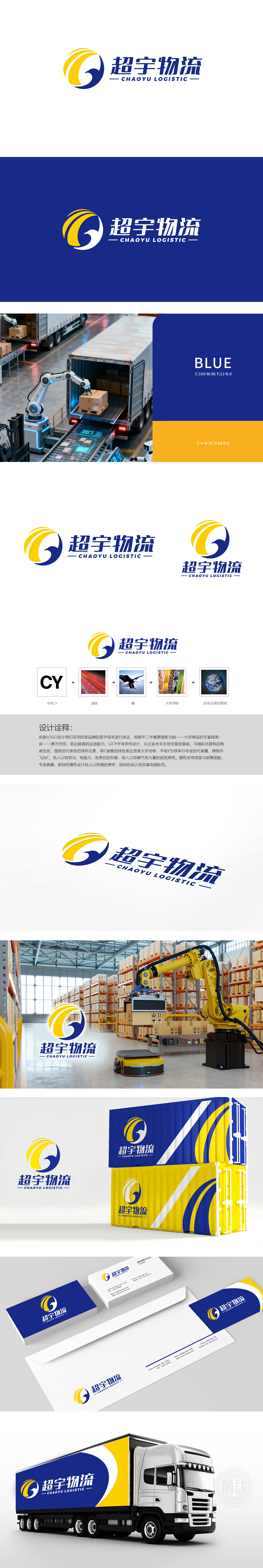
狮动设计以品牌首字母“CY”为基础,将“C”设计为流畅的环形轮廓,既象征“宇宙”的广阔空间感,又暗喻全球化物流网络的闭环能力;“Y”则巧妙融入“鹰”的形态——鹰的尖喙与展翅的线条被抽象为“Y”的斜线,赋予“速度、专业、高远”的精神符号,精准对应物流行业对“高效”和“覆盖力”的核心诉求。深蓝+明黄的撞色搭配极具记忆点:深蓝传递“专业、稳重、可靠”,明黄则象征“活力、速度、效率”,两种颜色的对比既强化视觉冲击力,又暗合“大宗商品运输”中“沉稳服务+高效执行”的双重属性。仅用一个LOGO就将“大宗商品的厚重、全球物流的广阔、鹰击长空的速度”浓缩成视觉符号,每个细节都在精准“翻译”物流的核心逻辑!
Lion design is based on the brand initials "CY" and designs "C" as a smooth circular outline, which not only symbolizes the vast sense of space of the "universe", but also implies the closed-loop ability of the global logistics network. "Y" is skillfully integrated into the form of "eagle"-the eagle's beak and the lines of spreading wings are abstracted as oblique lines of "Y", which gives the spiritual symbol of "speed, professionalism and lofty" and accurately corresponds to the core demands of the logistics industry for "efficiency" and "coverage". The contrast of dark blue and bright yellow is very memorable: dark blue conveys "professionalism, steadiness and reliability".


扫码或拨打添加客服微信


