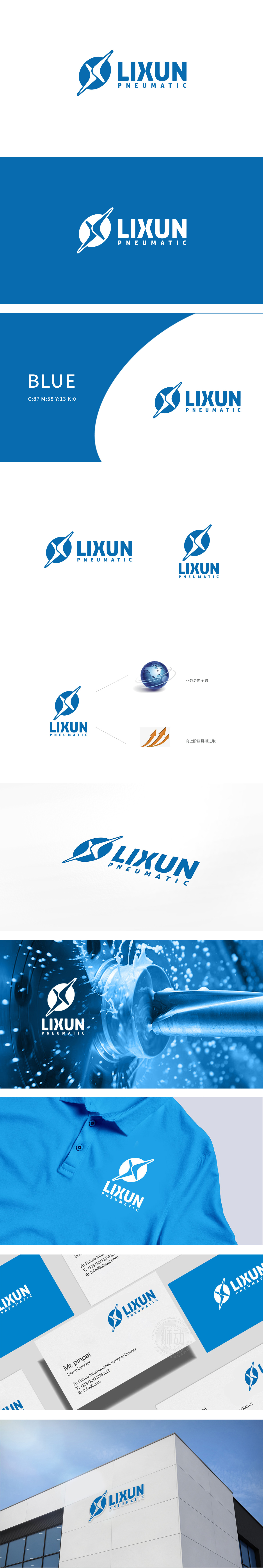
狮动设计以蓝色圆形背景中嵌入白色“X”形与箭头组合,形似涡轮叶片的动态切割感,既呼应了“重工机械涡轮齿轮”的工业属性,又通过箭头的张力传递出气动技术的动力感与精准性。圆形轮廓象征全球化视野与品牌完整性,线条的锐角处理则强化了科技领域的专业严谨。科技蓝 贯穿主标志与地球图形的蓝色系,传递出精密、可靠的专业形象,整体通过几何变形组合,将行业特征与“全球化、拼搏进取”的品牌精神紧密融合。
Lion design embeds the combination of white "X" shape and arrow in a blue circular background, which looks like the dynamic cutting sense of turbine blades. It not only echoes the industrial attribute of "heavy machinery turbine gear", but also conveys the power sense and accuracy of pneumatic technology through the tension of arrow. The circular outline symbolizes the global vision and brand integrity, while the acute angle treatment of lines strengthens the professional rigor in the field of science and technology. Science and technology blue runs through the blue system of the main logo and the earth figure.


扫码或拨打添加客服微信


