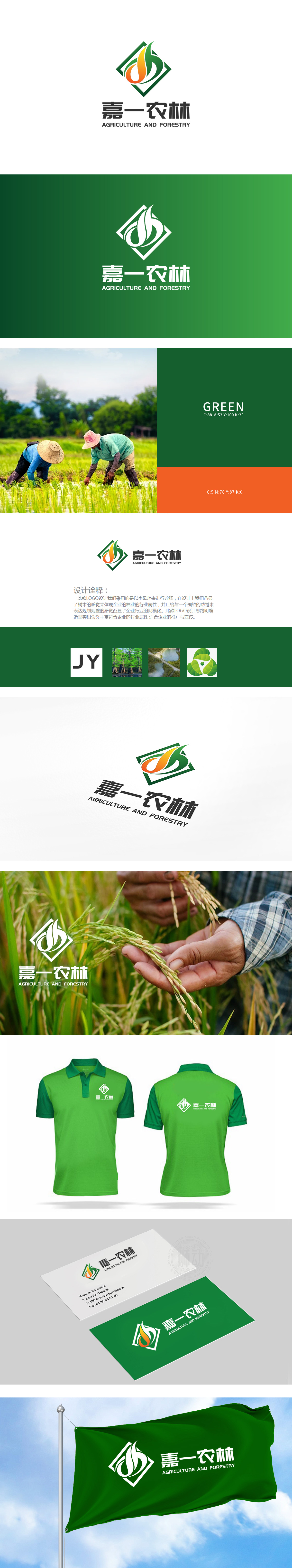
狮动设计以品牌名称首字母“JY”为设计起点,通过流畅的线条将字母与“树木形态”结合——绿色线条勾勒出树干挺拔的轮廓,顶部橙色与绿色渐变的“火焰/叶片”造型,既象征农林产业的生机与活力,又暗合“嘉一”(JY)的品牌基因,实现了“字母符号”到“行业符号”的自然过渡,绿色菱形外框不仅形成稳定的视觉边界,强化LOGO的规整感,也呼应了诠释中“规划规整、行业规模化”的企业定位,如同农林产业中有序的田垄、林场规划,传递出专业、系统的品牌形象。
Lion design starts with the initials "JY" of the brand name, and combines the letters with the "tree form" through smooth lines-green lines outline the tall and straight outline of the trunk, and the "flame/leaf" shape with orange and green gradient at the top symbolizes the vitality and vigor of the agriculture and forestry industry, and coincides with the brand gene of "JY", thus realizing the "letter symbol" to "industry symbol". Strengthening the sense of regularity of LOGO also echoes the enterprise positioning of "regular planning and large-scale industry" in the interpretation.


扫码或拨打添加客服微信


