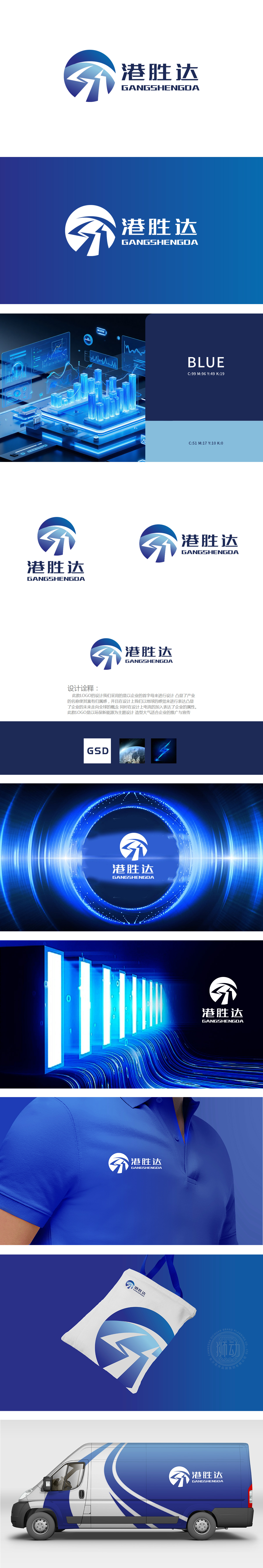
狮动设计以圆形轮廓来自首字母“G”的环形简化,既保留了首字母的识别基因,又通过“蓝白渐变”(呼应全球化愿景);环形内的“箭头状线条”,是字母“S”的曲线变形,同时借鉴了“电流流动”的形态,箭头的“向前趋势”,则暗合“达”(达成、发展)的品牌寓意,将“港胜达”的名字转化为“动态成长”的视觉符号。狮动不是在“画LOGO”,而是在“为品牌设计一个‘视觉代言人’。
Lion design is simplified by the circular outline from the first letter "G", which not only retains the recognition gene of the first letter, but also adopts "blue-white gradient" (echoing the vision of globalization); The "arrow-shaped line" in the ring is the curve deformation of the letter "S" and draws lessons from the shape of "current flow". The "forward trend" of the arrow coincides with the brand meaning of "Da" and transforms the name of "Hong Kong Shengda" into a visual symbol of "dynamic growth".


扫码或拨打添加客服微信


