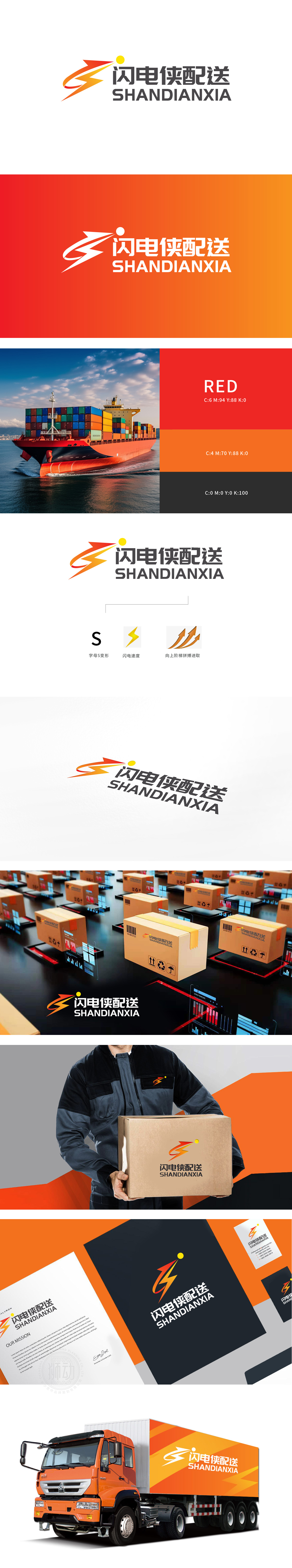
狮动设计用“符号化元素”强化物流属性,S变形:既是“闪电侠”首字母,也是“物流”的英文首字母,通过字母符号强化品牌记忆点;闪电形态:直接关联物流的核心卖点“速度”(闪电=瞬间到达),红橙渐变的配色像流动的能量,视觉上自带“快”的冲击感;S形整体向右倾斜,隐含“配送流向”的动态感,符合物流“流动”的本质属性。用极简图形语言精准戳中了“速度、信任、成长”三大关键,传递这是一家快(闪电)、稳(S形的扎实)、有野心(阶梯进取)的物流企业”。
Lion design uses "symbolic elements" to strengthen the logistics attributes. S deformation: it is not only the initials of "Flash" but also the English initials of "Logistics", and strengthens the brand memory point through letter symbols;Lightning form: it is directly related to the core selling point of logistics "speed" (lightning = instant arrival), and the gradual color matching of red and orange is like flowing energy, which has a "fast" impact feeling visually; The whole S-shape leans to the right, which implies the dynamic sense of "distribution flow direction" and conforms to the essential attribute of logistics "flow".


扫码或拨打添加客服微信


