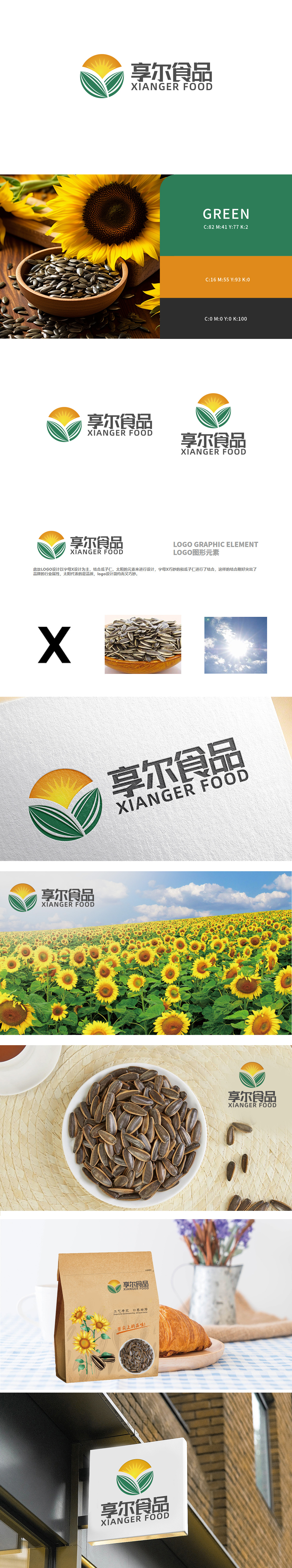
狮动设计以“X”为结构骨架,两片对称的绿色图形轮廓,抽象还原了瓜子仁尖端微翘、边缘圆润的形态,绿色象征自然、健康,贴合食品行业对“原生、无添加”的品质诉求,同时“X”的交叉结构增强了图形的稳定性与现代感。顶部的橙黄色圆形光芒,既代表阳光赋予瓜子生长的自然能量,又隐喻品牌对“新鲜、优质”的品质追求,为品牌注入温暖、可信赖的视觉联想。整休以几何线条勾勒“X+瓜子仁+太阳”的复合意象,符合现代品牌“轻量化、高辨识度”的传播需求。
Lion Design takes "X" as the structural skeleton, and two symmetrical green graphic outlines on the right side, which abstractly restores the shape of melon seeds with slightly tilted tips and rounded edges. Green symbolizes nature and health, which meets the quality demands of the food industry for "original, non-additive". At the same time, the cross structure of "X" enhances the stability and modernity of the graphics. The orange-yellow round light at the top not only represents the natural energy given by the sun to the growth of melon seeds, but also symbolizes the brand's.


扫码或拨打添加客服微信


