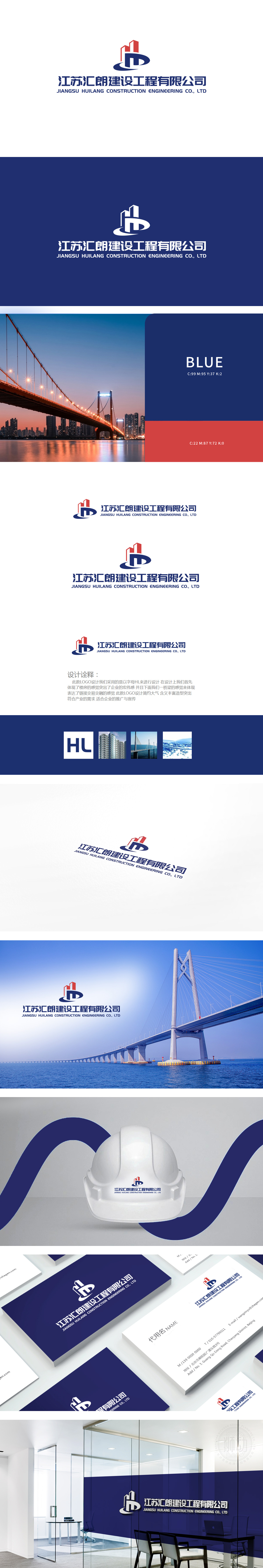
狮动设计通过“HL”字母:巩固品牌识别,让“汇朗”的名称与图形形成强绑定;上方红色几何形:以简洁的棱角与分层结构,模拟出高楼大厦的轮廓——挺拔的线条、向上的趋势,瞬间传递出建筑行业的“宏伟大气”,直接点出企业“建设工程”的核心业务;红色作为主色,更添专业感与热情,像建筑人对行业的执着。下方蓝色波浪形:以曲线与折线的组合,抽象成桥梁的支撑结构,既呼应了“汇朗”中“汇”(链接、汇聚)的含义,又传递出建筑的“连接本质”:桥梁连接两岸,建筑连接人与城市、企业与客户。蓝色则象征可靠与科技,符合建筑工程的“稳扎稳打”。层层递进”的图形逻辑, 构建了“形意合一”的建筑语言。
Lion design adopts the letter "HL": consolidate brand recognition and make the name of "Huilong" strongly bound with graphics; Red geometry above: with simple edges and corners and layered structure, it simulates the outline of high-rise buildings-straight lines and upward trends, instantly conveys the "magnificent atmosphere" of the construction industry, and directly points out the core business of the enterprise's "construction project"; As the main color, red adds a sense of professionalism and enthusiasm, like the persistence of builders in the industry. Blue wave below: the combination of curves and broken lines is abstracted into the supporting structure of the bridge.


扫码或拨打添加客服微信


