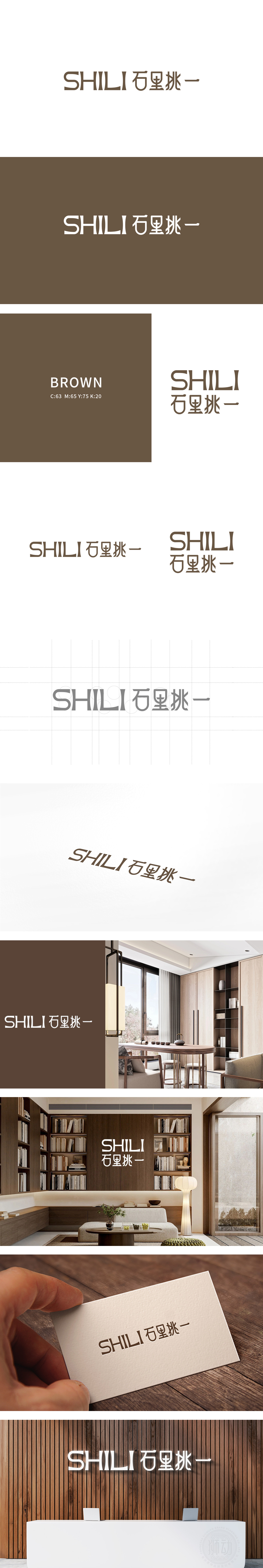
狮动设计将石”字的符号化改造,既保留了“石”的辨识度,又将“石材、建筑、家居”的元素融入字形,直接点题“石里挑一”的品牌名,“粗粝感的极简”,配合深棕色调,瞬间传递出“家居装饰”所需的稳重、质感、亲和力,当你盯着“SHILI 石里挑一”这行字看3秒,会突然想起摸过的第一块实木地板的温度——粗粝却细腻的笔画像木材的肌理,深棕的色调像晒透的胡桃木桌沿,而“石”字里的十字格,简直就是你家窗户漏进来的光斑,亦是装修时贴过的砖块纹理——不用提“家居”两个字,它已经把“家”的味道刻进了字形里。
Lion design transforms the symbol of the word "stone": it not only retains the recognition of the word "stone", but also integrates the elements of "stone, architecture and home" into the glyph, directly points out the brand name of "one of the stones" and "the minimalism of rough feeling", and cooperates with the deep earthy tones to convey the stability, texture, affinity and instant need of "home decoration". I suddenly think of the temperature of the first solid wood floor I touched-the rough but delicate strokes are like the texture of wood, and the dark brown tone is like the edge of a sun-dried walnut table.


扫码或拨打添加客服微信


