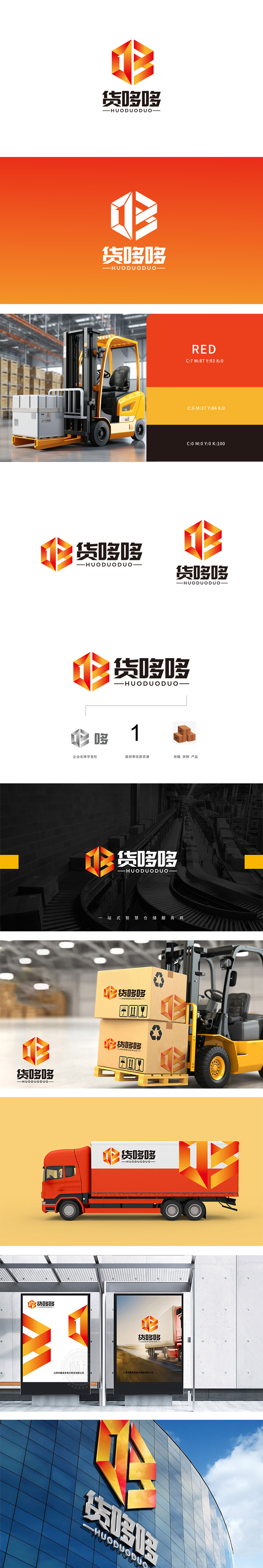
狮动设计以货哆哆”的字形变形,用黑体加粗+局部圆角处理,既保留了名称的识别性,又通过“哆”字的重复感,暗合“货物繁多、流转不息”的物流场景;用加粗的无衬线字体标注“高效率优质资源”,直接把物流的核心诉求“高效”转化为最直观的符号(“1”代表第一、最快),整体把品牌的“名字”和“业务”变成了同一个视觉符号,让人记住名称的同时,立刻联想到“这是做物流的”,符合物流品牌“活力+专业+务实”的形象定位。
Lion design is deformed in the shape of "many goods", and it is bolded in bold and partially rounded, which not only retains the recognition of the name, but also coincides with the logistics scene of "many goods and endless circulation" through the repetition of the word "many". Marking "high efficiency and high quality resources" with bold sans serif font directly transforms the core demand of logistics "high efficiency" into the most intuitive symbol,and turns the brand "name" and "business" into the same visual symbol as a whole.


扫码或拨打添加客服微信


