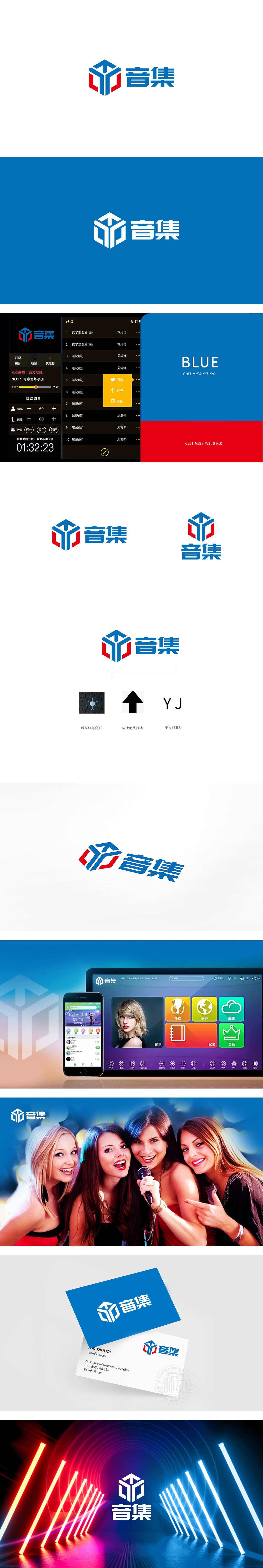
狮动设计采用蓝红撞色的几何拼接结构,以六边形(蜂巢的核心形态)为基础框架,象征“协作、创新、可持续”——蜂巢是自然界最具“科技感”的结构(规律、高效、生命力),对应“科技蜂巢变形”的设计注解,直接关联科技行业的“技术驱动”属性;箭头(拼搏):代表企业的“发展态度”——向上的方向传递“拼搏、成长、突破”的企业精神,呼应“向上箭头拼搏”的关键词;整体将企业的“硬属性”(科技)与“软精神”(拼搏)通过“品牌符号”。实现科技感与人文精神”的完美平衡。
Lion design adopts the geometric splicing structure with blue and red contrast, and takes hexagon (the core form of beehive) as the basic framework, symbolizing "cooperation, innovation and sustainability"-beehive is the structure with the most sense of science and technology in nature (regularity, efficiency and vitality), which corresponds to the design annotation of "deformation of technological beehive" and is directly related to the "technology-driven" attribute of scientific and technological industry. Arrow (Struggle).


扫码或拨打添加客服微信


