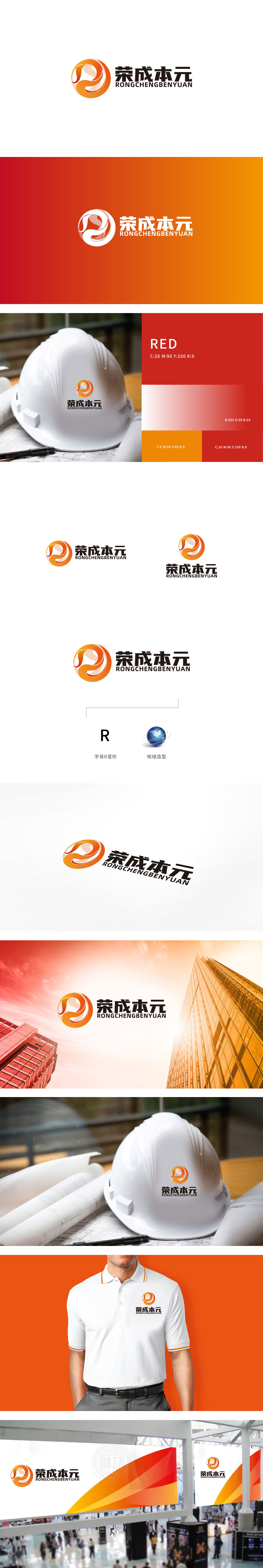
狮动设计以橙色渐变的圆形为基底,嵌套了流畅的曲线组合,元」的变形:曲线的走势隐约勾勒出「元」字的轮廓,直接呼应品牌名称中的「元」(「价值本源」);流动感:曲线的转折与环绕形成「循环」与「动态」的视觉效果,象征「成本管理的闭环优化」圆形基底:圆形是最具「完整性」与「包容性」的几何形状,传递「专业覆盖全面」「服务闭环可靠」的信任感。LOGO的色彩与形态组合,精准传递了「稳健的专业度」与「创新的活力感」,这正是成本管理、工程咨询类企业最需要的品牌形象。
Lion design is based on the orange gradient circle, and it is nested with a smooth curve combination, and the deformation of yuan: the trend of the curve vaguely outlines the outline of the word yuan, which directly echoes the yuan ("value origin") in the brand name; A sense of fluidity: the turning and surrounding of the curve forms a "circular" and "dynamic" visual effect, which symbolizes "closed-loop optimization of cost management" Circular base: Circular is the most "complete" and "inclusive" geometric shape, conveying the trust of "comprehensive professional coverage" and "reliable closed-loop service".
.


扫码或拨打添加客服微信


