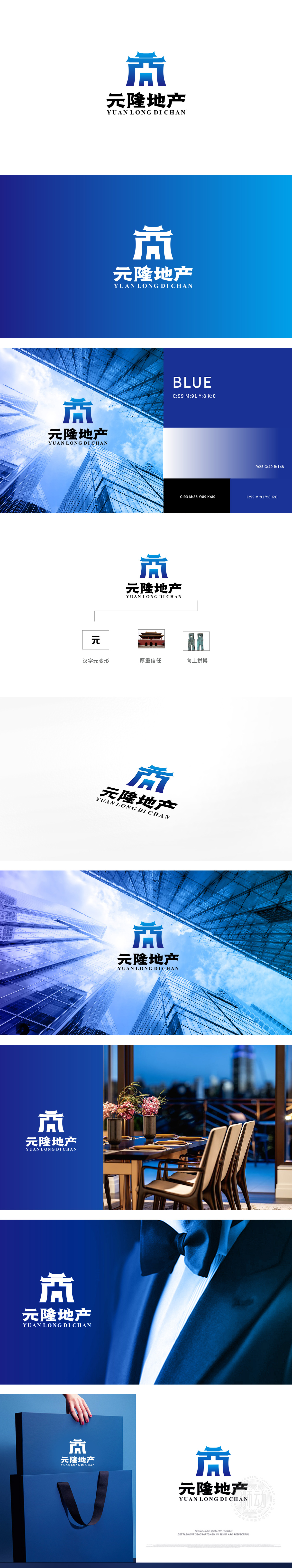
狮动设计以“元”字为视觉原点,结合传统建筑元素,传递“企业根源深厚、传承经典”的品牌形象。蓝色渐变的色彩选择,既符合地产行业“稳重、专业”的调性,又通过渐变增强了图形的层次感与现代感。向上的造型则强化了“拼搏、成长”的主题,传递企业积极进取、追求卓越的发展理念。整个视觉体系的设计风格既保留传统底蕴,又不失现代感。
Lion design takes the word "Yuan" as the visual origin, and combines traditional architectural elements to convey the brand image of "deep roots of enterprises and inheriting classics". The color selection of blue gradient not only conforms to the "stable and professional" tonality of real estate industry, but also enhances the layering and modernity of graphics through gradient. Upward modeling strengthens the theme of "struggle and growth" and conveys the development concept of enterprise's initiative and pursuit of Excellence.


扫码或拨打添加客服微信


