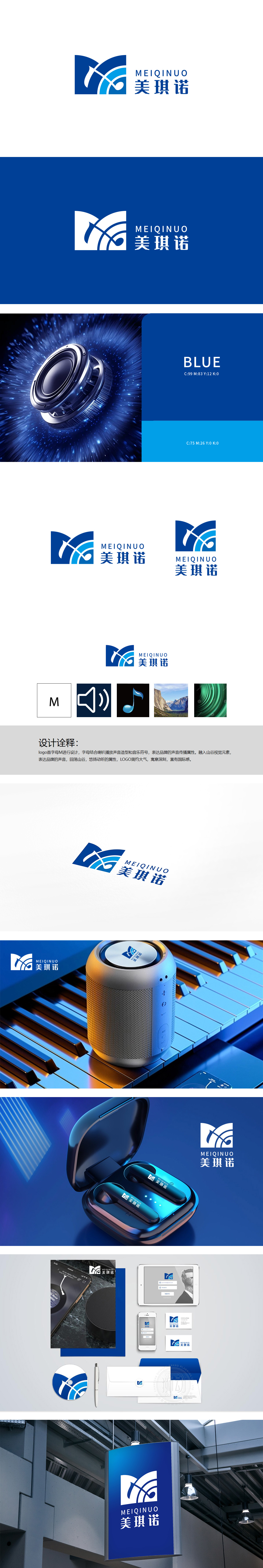
狮动设计以品牌首字母「M」为核心骨架,M的中间曲线:融入音乐符的弧度,强化“音乐/音频”的内容属性;M的整体轮廓:顶部的浅蓝渐变弧面+底部的深蓝基底,巧妙模拟了“山谷的起伏形态”,将“声音回荡山谷”的听觉感受转化为视觉符号,瞬间激活“悠扬、持久、有穿透力”的品牌联想:蓝白为主的配色(深蓝=专业/科技,浅蓝=清新/自然)+ 渐变的层次感,既符合“国际感”的现代审美,又避免了过于冷硬的科技感,平衡了“专业”与“亲和”。每一个元素都在替品牌“讲”自己的故事。
Lion design takes the brand initials * * "M" as the core skeleton, and the middle curve of M: incorporating the radian of musical symbols to strengthen the content attribute of "music/audio"; The overall outline of M: light blue gradient cambered surface at the top+dark blue substrate at the bottom, which skillfully simulates the "ups and downs of the valley", transforms the auditory feeling of "sound echoing the valley" into a visual symbol, and instantly activates the brand association of "melodious, lasting and penetrating".


扫码或拨打添加客服微信


