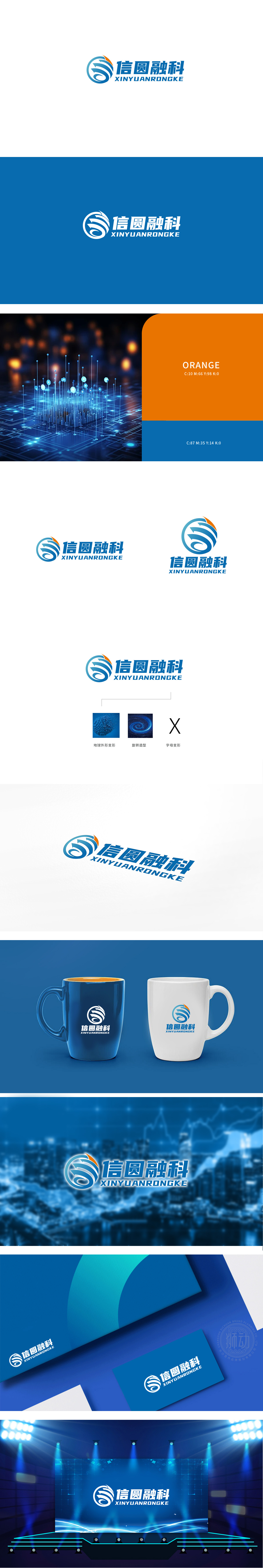
狮动设计以圆形为基底,既代表「完整性」,也象征「循环性」(技术迭代的无限性),同时暗示品牌「全球化」的布局野心,螺旋箭头:箭头:直接关联「传递」「前进」,契合通信行业「信息流动」的核心属性(如信号传输、数据交互);蓝白渐变:从浅蓝到深蓝的过渡,模拟「科技感」的层次感,增强视觉的「未来感」,整体设计匹配了通信行业「传递、覆盖、技术」的属性,通过简洁的视觉语言让人过目不忘。
Lion design is based on a circle, which not only represents "integrity" but also symbolizes "circularity" (infinite technical iteration), and at the same time implies the layout ambition of the brand "globalization". Spiral arrow: arrow: directly relates to "transmission" and "progress", and fits the core attributes of "information flow" in the communication industry (such as signal transmission and data interaction). Blue-white gradient: the transition from light blue to dark blue simulates the layering of "sense of technology" and enhances the visual sense of "future".


扫码或拨打添加客服微信


